Aeroperú _1993
Identity
In 1993 the flag carrier, Aeroperú, went through a privatization process and was bought by Aeromexico, after which it was decided to renew its visual identity. Aeroperú represented our Peruvian culture and was one of the first Peruvian brands to travel around the world carrying our natural and cultural wealth. Being Peru our main creative input, different conceptual paths were explored, all by hand.
Aeroperu’s logo has an isotype that represents our cultural and ancestral value by joining three Peruvian icons: the sun, the tumi and Lambayeque gold mask.
The following is the story of the creative process of an identity that represents Perú and the new direction of this well-known airline.
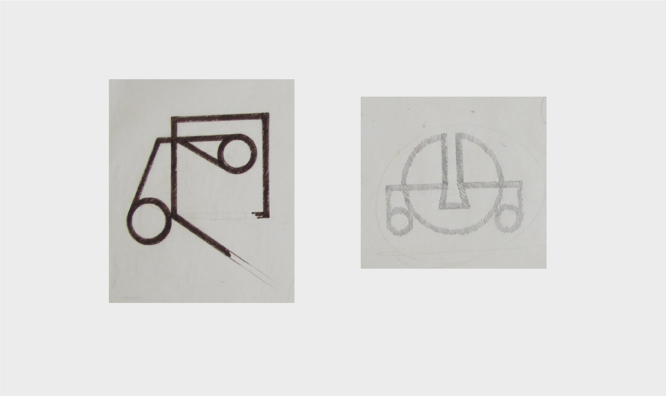
Below are several hand-drawn sketches


Here are some explorations of the typography that would follow our isotype
Aeroperú represented our Peruvian culture, it was one of the first Peruvian brands that traveled the world carrying our natural and cultural wealth. So, the brand identity shows a mask that integrates three elements:
The sun, a fundamental part of our
ancestral culture and that constitutes
part of the sky.
The Lambayeque gold mask,
the human component, the face
of our Peruvianness.
And the Tumi, our ceremonial knife,
representative of our culture
and Peruvian arts.


Slider of Aeroperu’s airplane sketches


