GUARANÁ BACKUS
Packaging
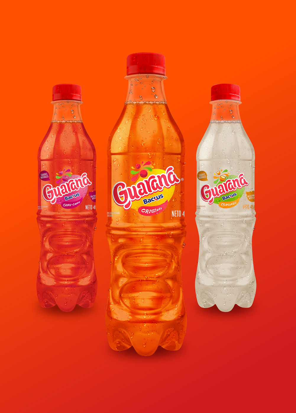
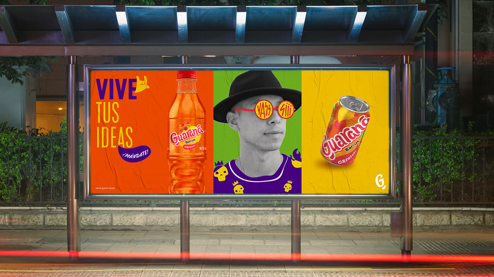
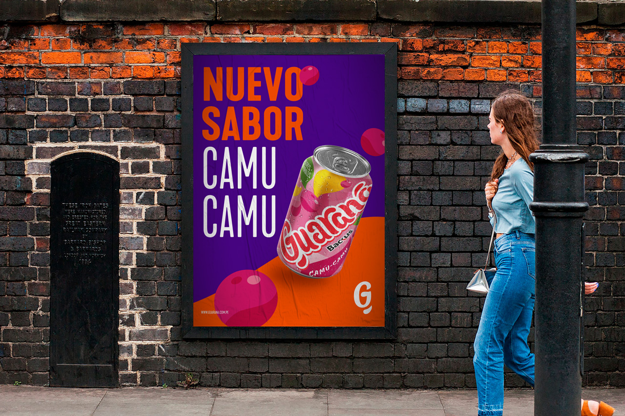
Guaraná Backus, a Peruvian soft drink characterized by its unique flavor, came in search of an evolution that would help them connect with the young generation Z.
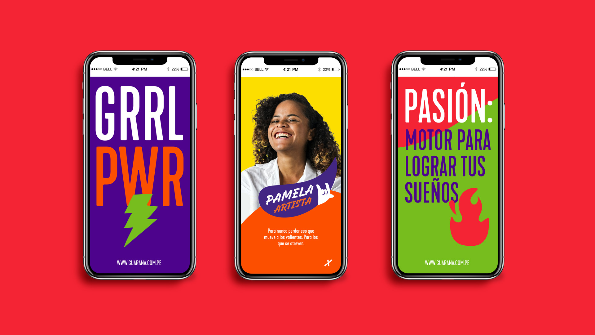
The challenge was to generate a change that doesn’t feel abrupt, but powerful enough to hook up with the target without losing identity. Therefore, inspired by the fluidity and spontaneity of young people we created the concept GUARAFLOW.
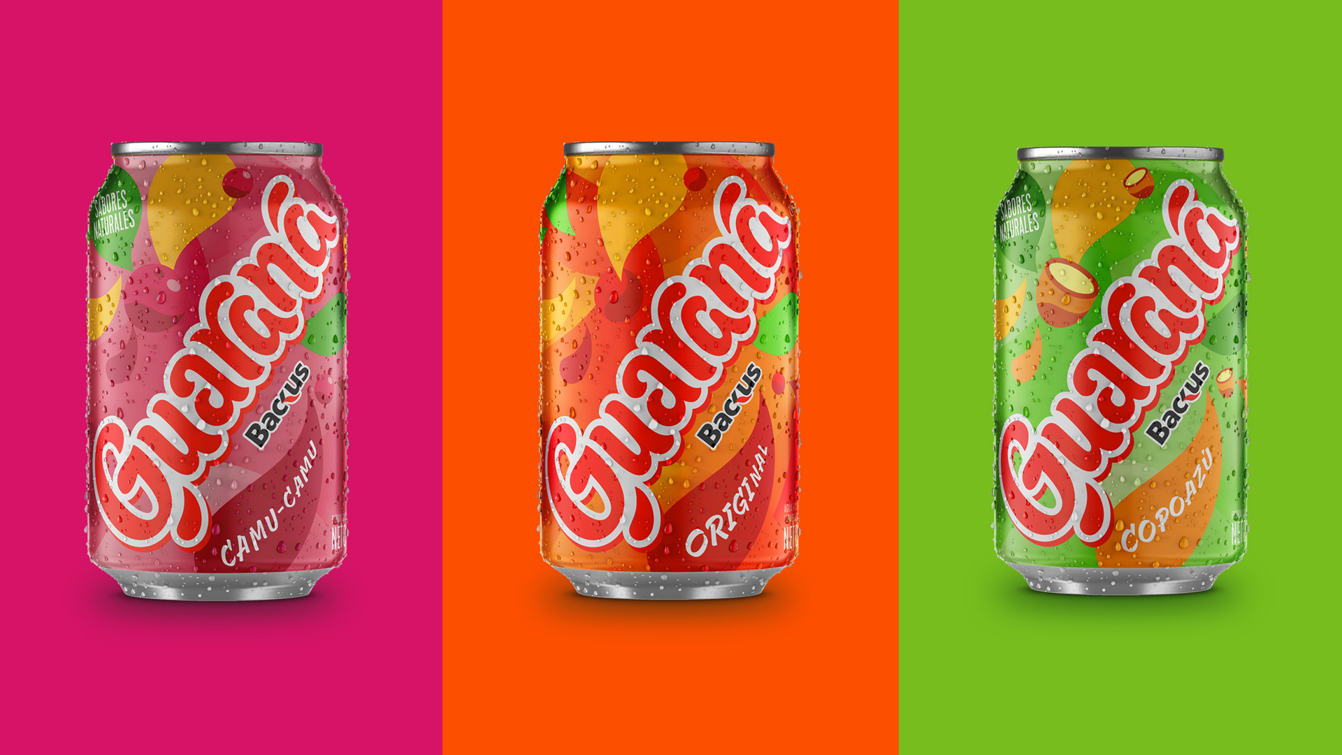
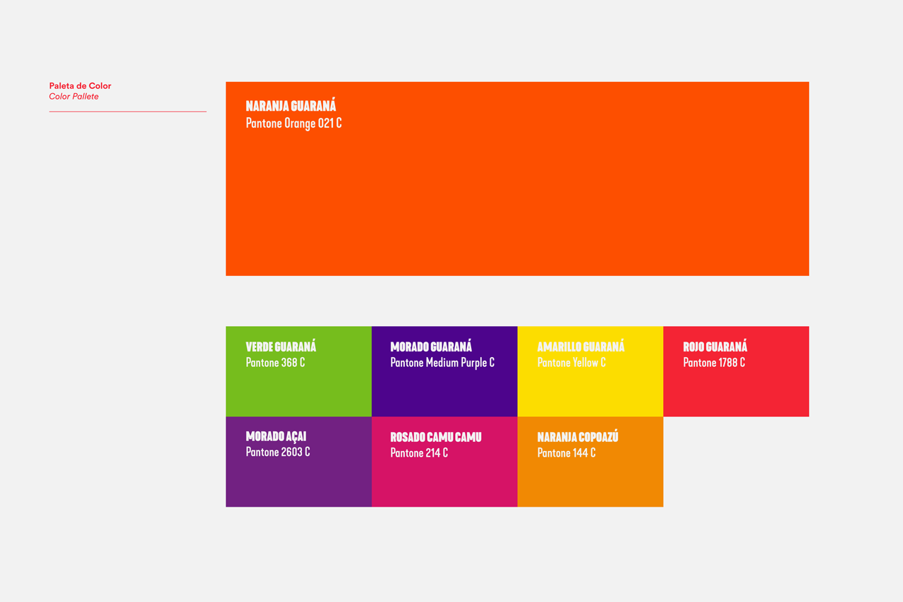
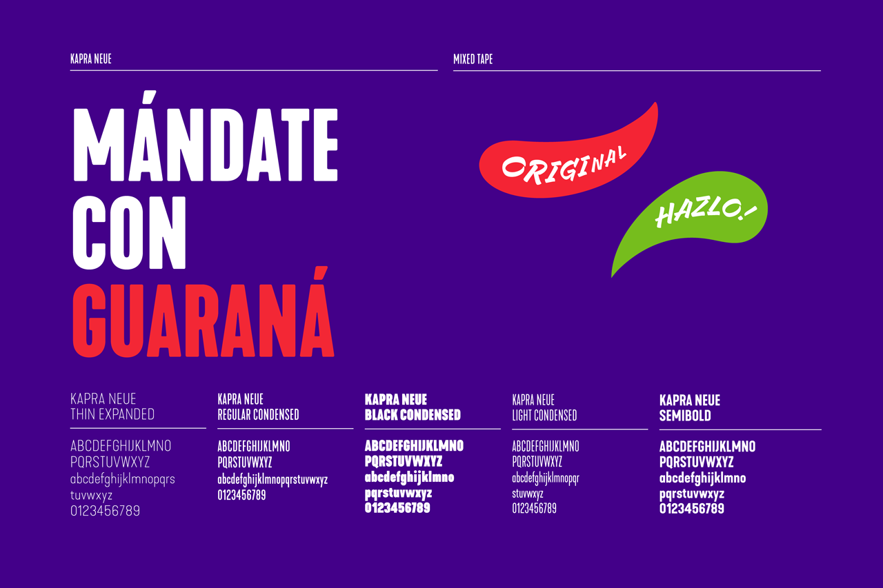
We took the logo and graphic elements of the identity and updated them, taking inspiration from the previous ones by cleaning and giving them new shapes, exploiting organic forms and using colors strategically.
For all this, one of the favorite soft drinks of Peruvians, was renewed to remain in the hearts of Peruvians, talking and feeling like the youngest, but without losing its essence. Recovering the best of its trajectory, and being able to live and connect with today.
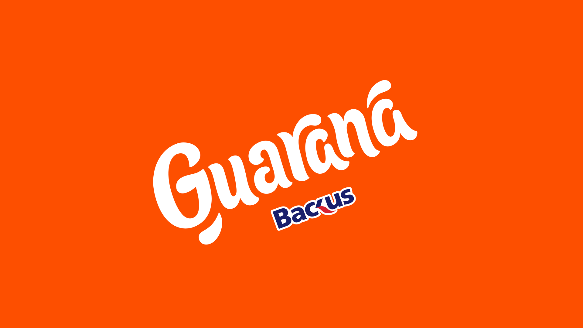
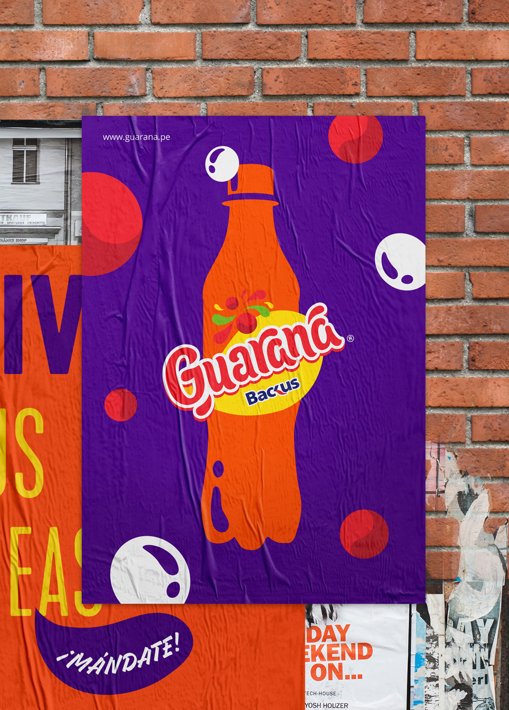
The brand is orange
like the color of its liquid,
and it lives this way in
all its communication pieces,
leaving the red version
only for the labels.

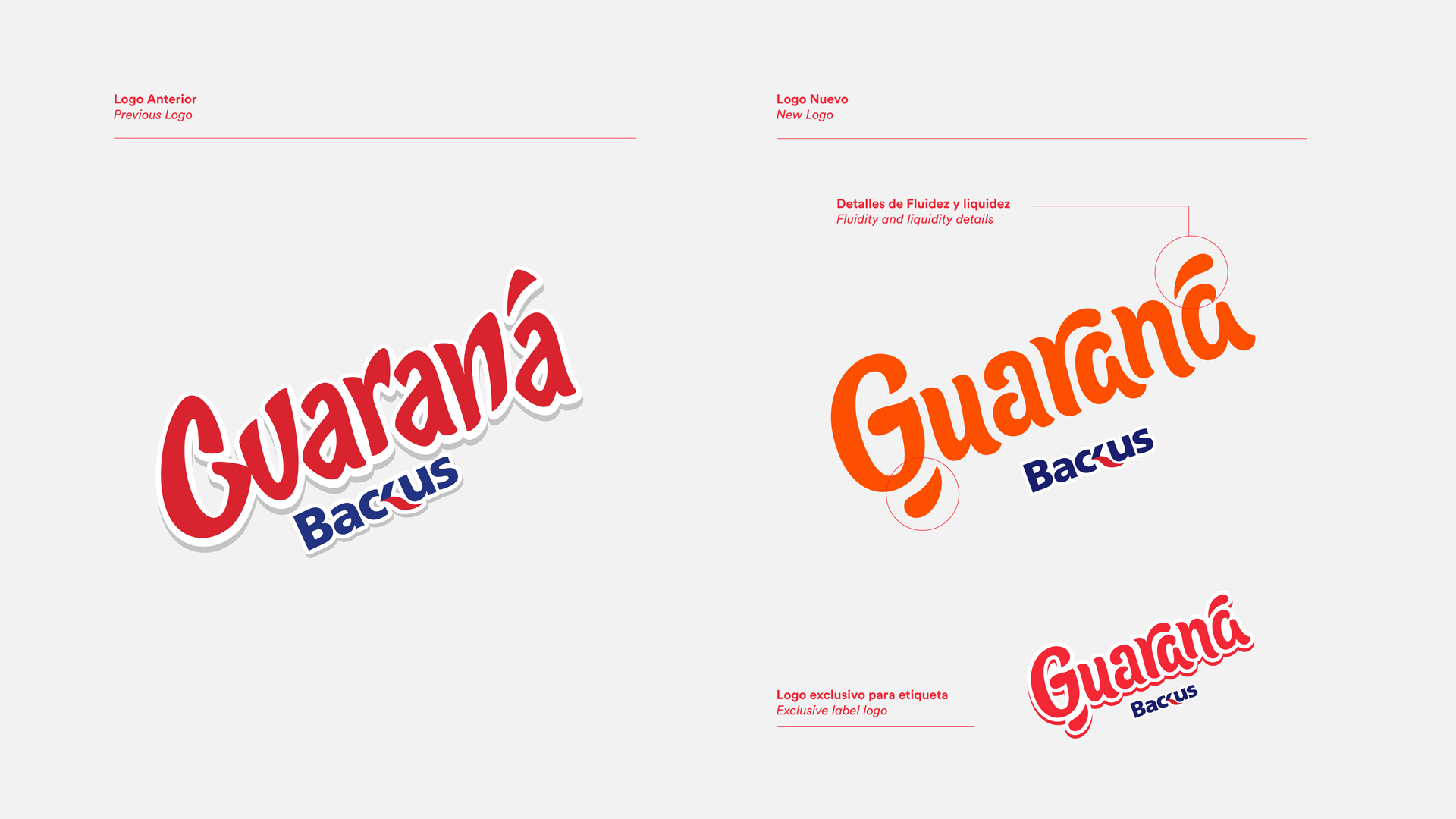
Keeping the same color
label and the urban
expressiveness of the
previous logo, we refined
its legibility, adding
proprietary details inspired
by the liquidity of the product,
which together with the
synthesis of the fruits and
elements that accompany it,
generate a label of organic
forms with a proprietary,
playful and versatile style.
