Pilsen Callao
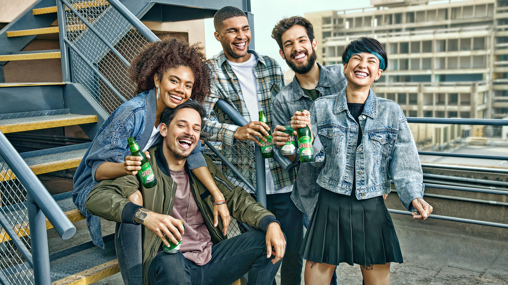
Gathering friends
since 1863
Packaging
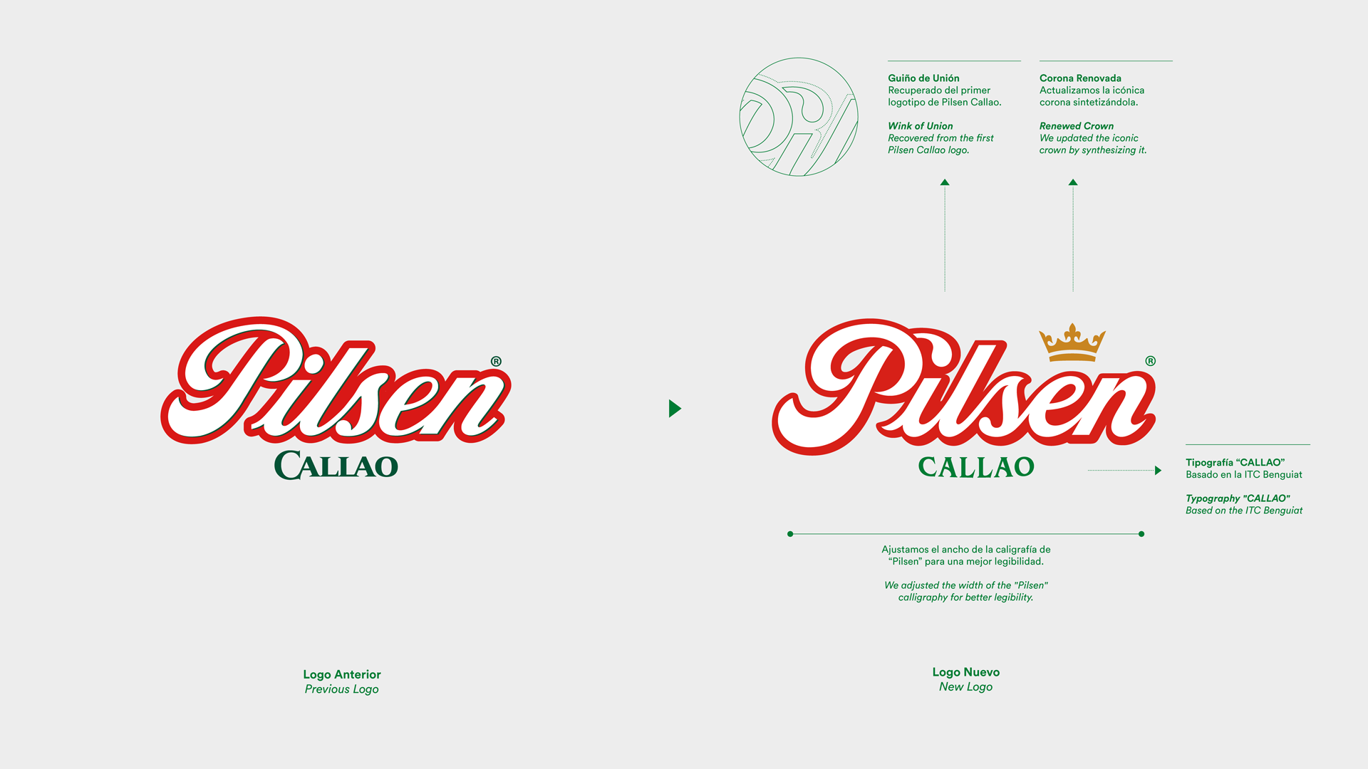
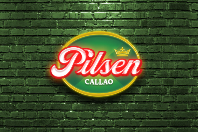
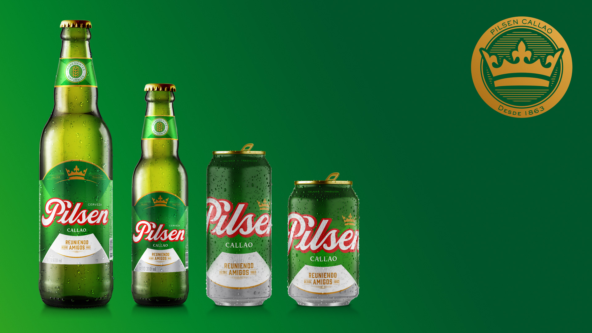
This Peruvian lovemark, which has been generating friendships since 1863, was looking for a visual evolution that would be able to connect with new consumers as well as the usual ones. This challenge led us to an in-depth analysis of 157 years of Pilsen Callao´s history, taking the most iconic elements – such as the calligraphy and the crown – into a more contemporary world.
The green of Pilsen Callao was also revitalized, bringing it to life and gaining a wider palette.
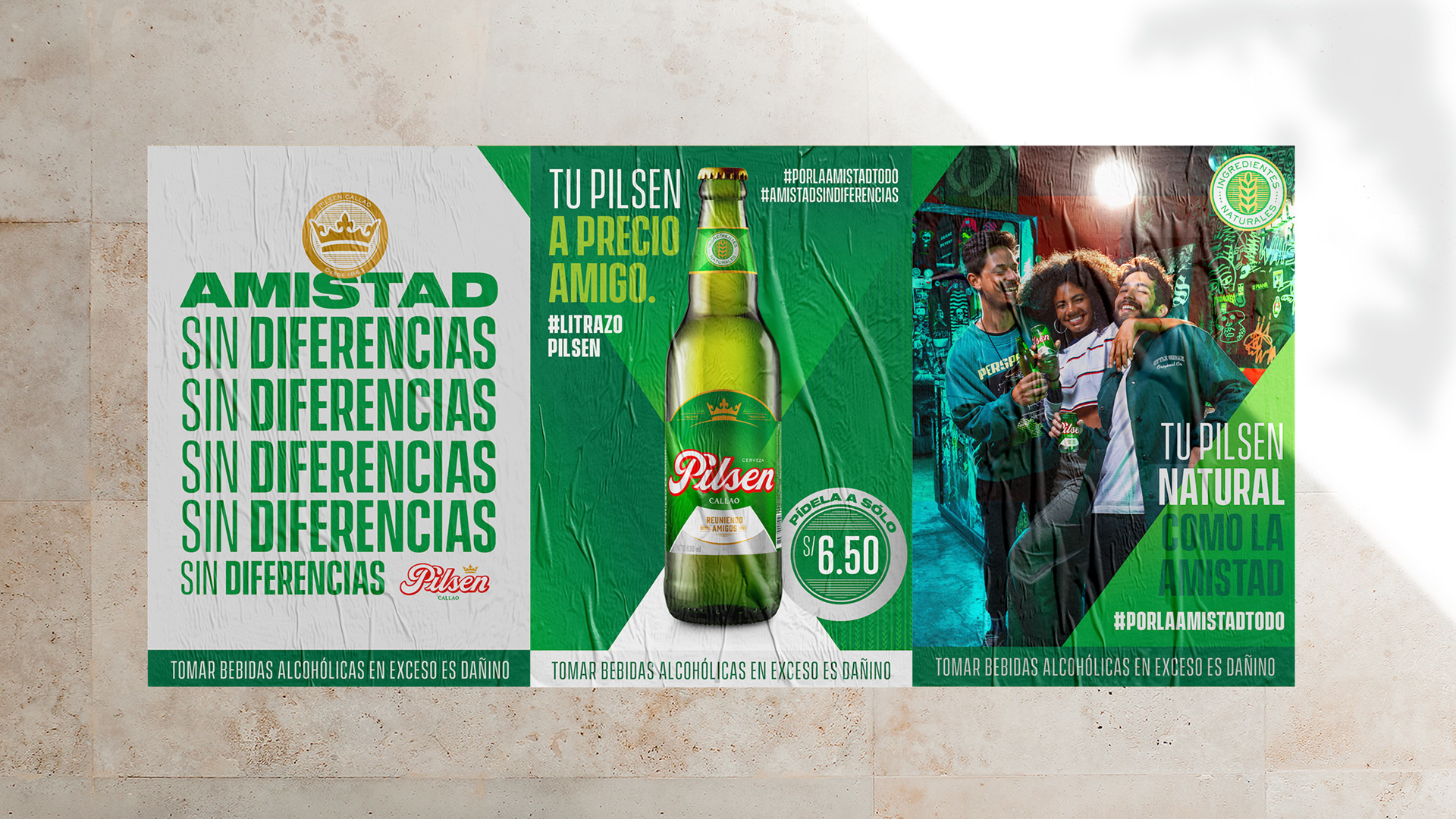
Our visual system is inspired by true friendship. That’s why we generate “the big meeting”, an intersection that works as a versatile tool around their different types of communications.

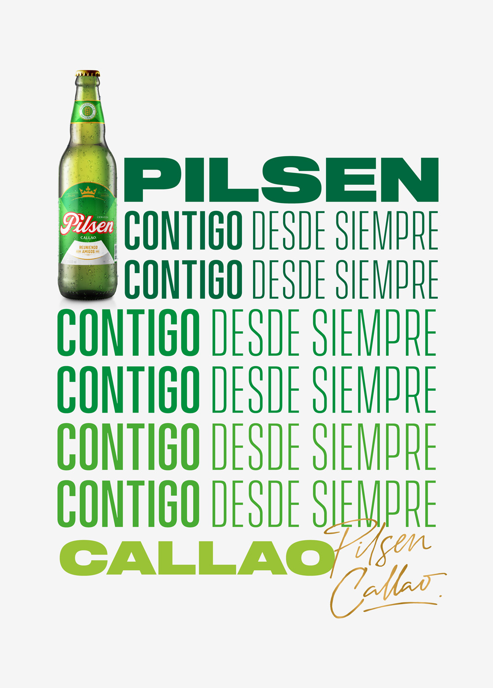
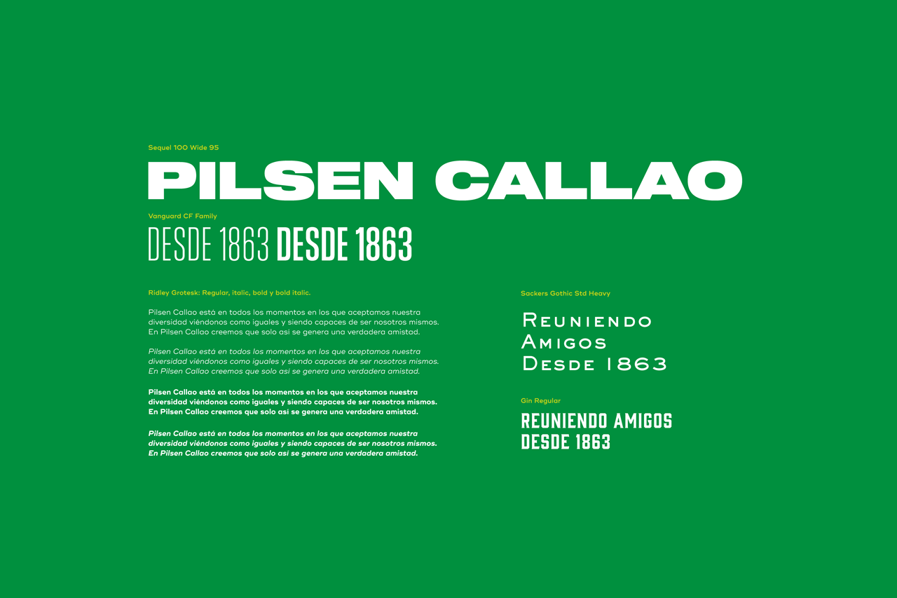
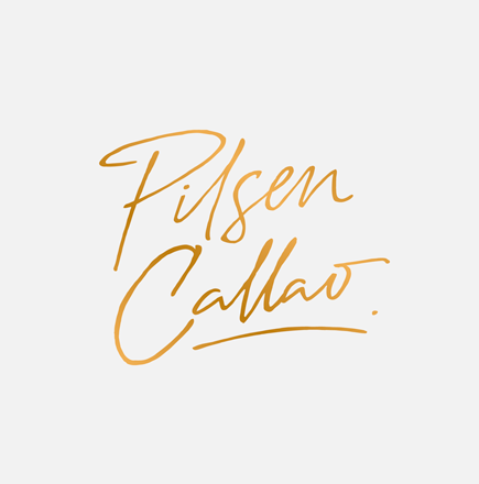
The famous calligraphy of Pilsen
Callao was modernised without
losing its expressiveness.
Taking details from the previous
one, we improved the legibility
and recovered a link between
the “P” and the “i”.
A wink to the 1863 logo.
At the same time, we worked on
the crown which was incorporated
into the brand in 1980.
Now the crown is a free and
flexible asset that pays tribute
to the brands history.



The great meeting: Our system
is born with this intersection
that unites, combines and mixes
our elements and tools that,
together with our green flag
converge in a single point
allowing us to generate
immediate recognition.

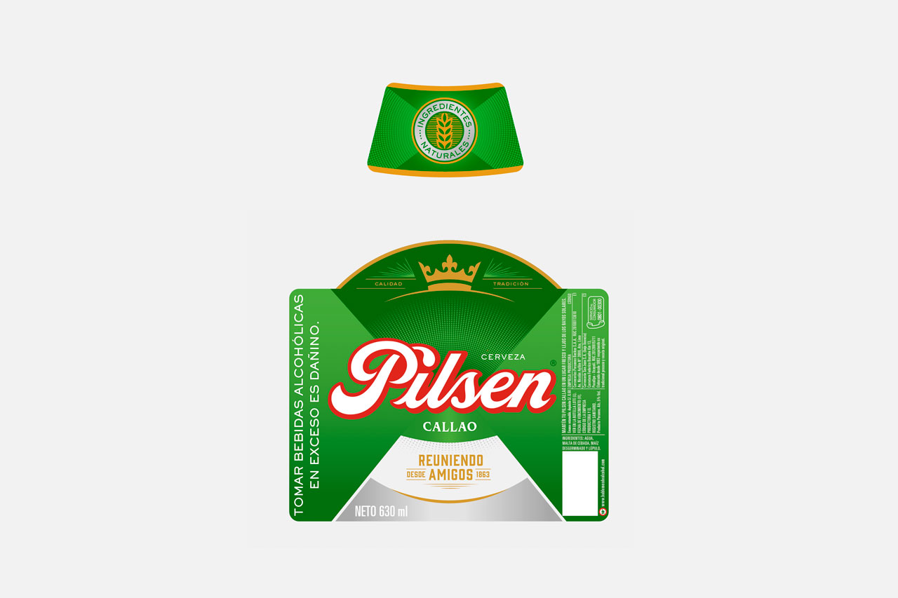
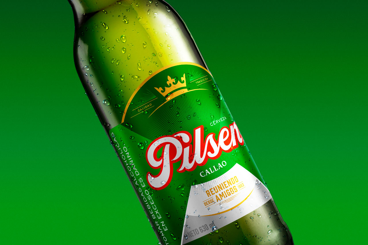
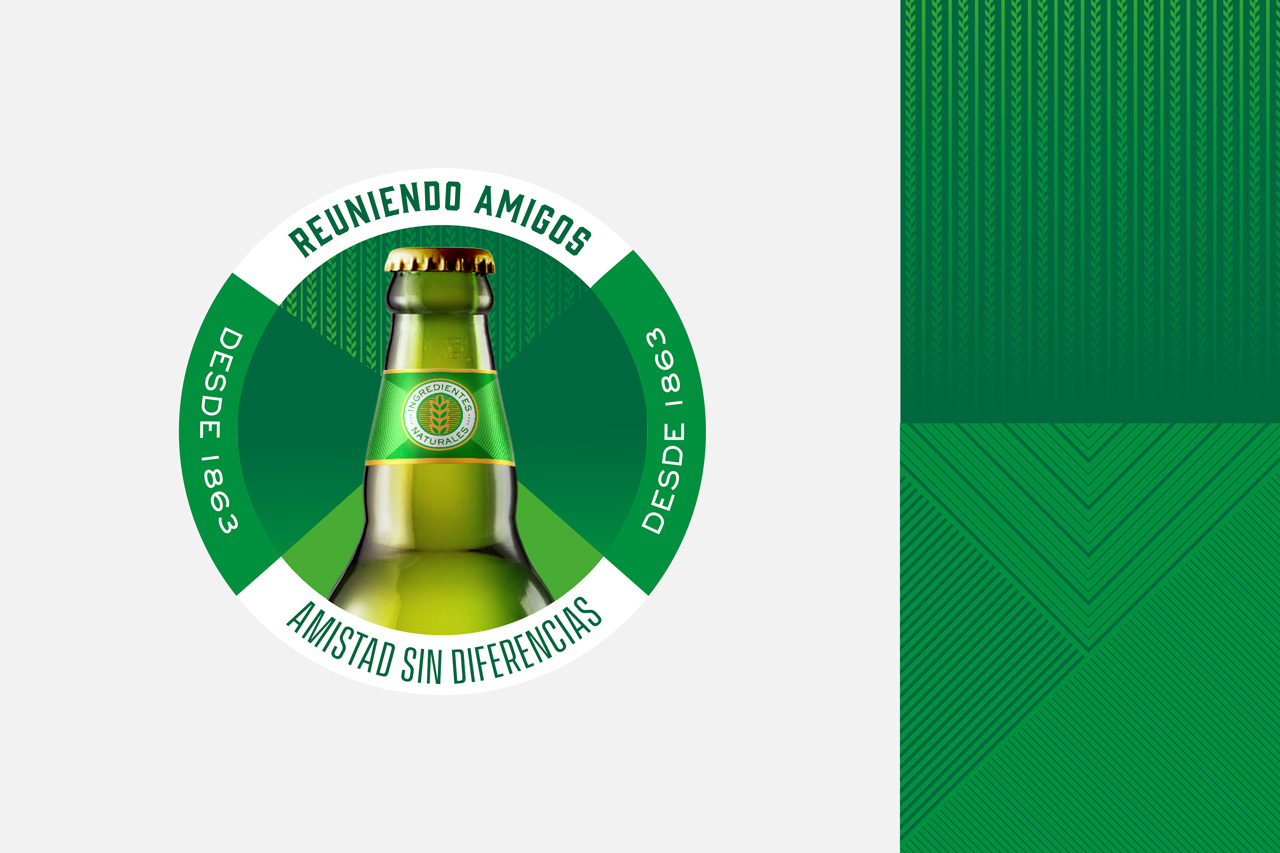

Green is good! Green is the color
of Pilsen Callao, living not only
in its bottle, but also in all its SKUs
and communications. We decided
to energize it, giving it more life
and generating a palette of
4 greens and a gradient, to have
more flexibility around the
communication needs.
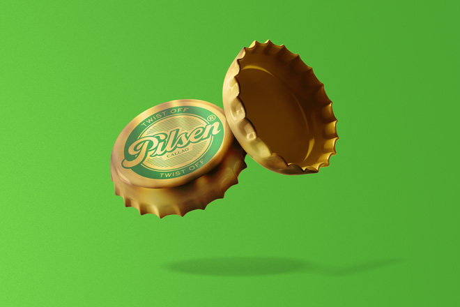
Gold and silver work as colors that
provide elegance and pay homage
to their transcendence.

🤘For always believing in a friendship without differences 🍻