Trilce
Identity
Trilce’s history dates back more than 30 years, when its first pre-university academy was founded. Today with nearly 30 schools nationwide and more than 24,000 students, it is one of the leaders in the category and in its constant innovation has decided to evolve its visual identity aiming to transmit its vision of the future.
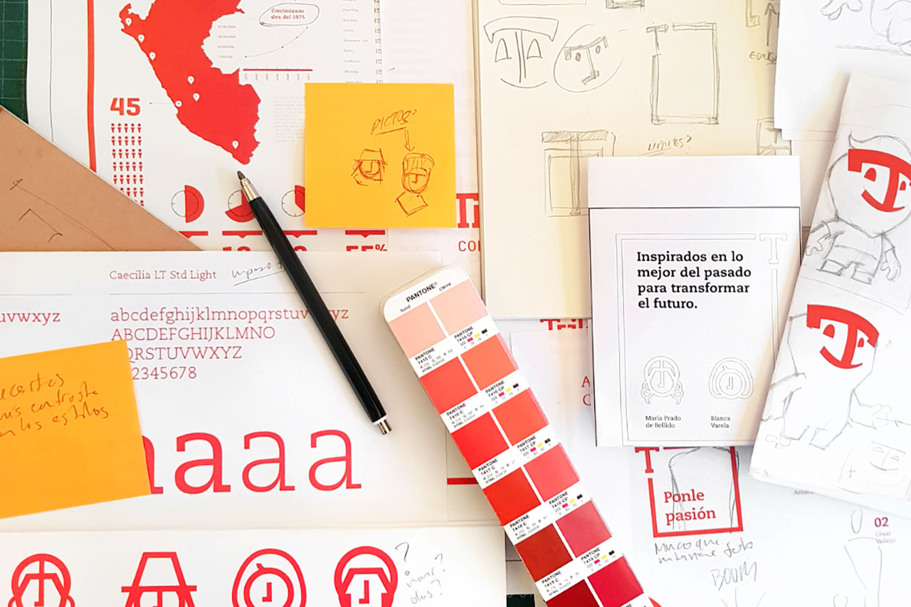
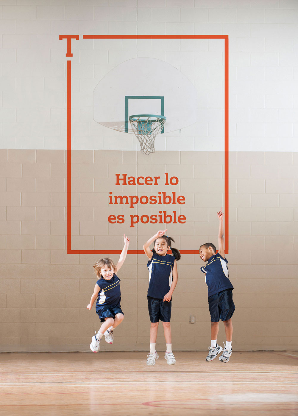
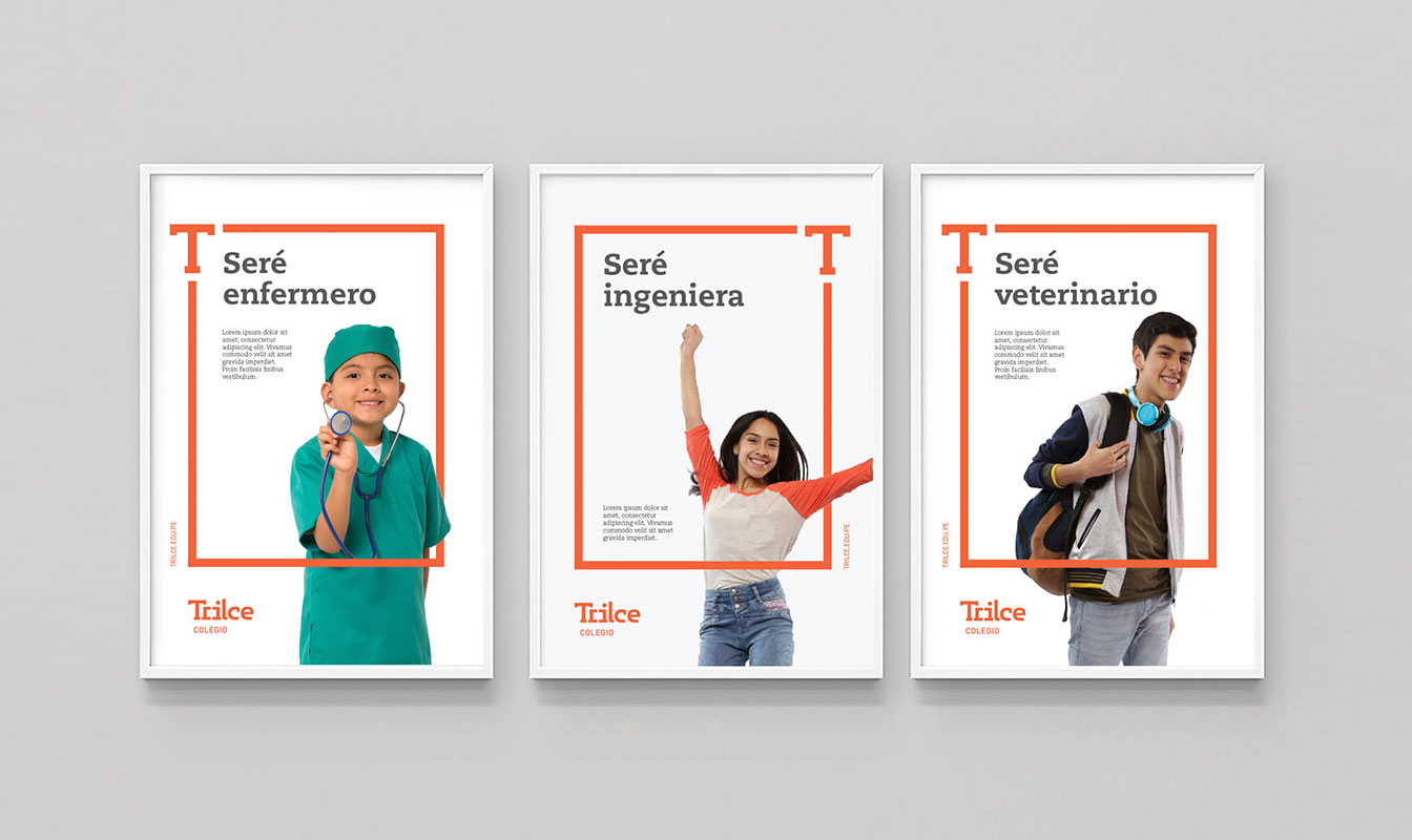
This is how we started this identity refreshing project, with the aim of showing a Trilce that, under the brand concept “Challenging limits” adapts to new times and shows itself as an institution that believes in the dreams of parents and children and works with the firm belief that limits do not exist and can be overcome with effort and dedication.
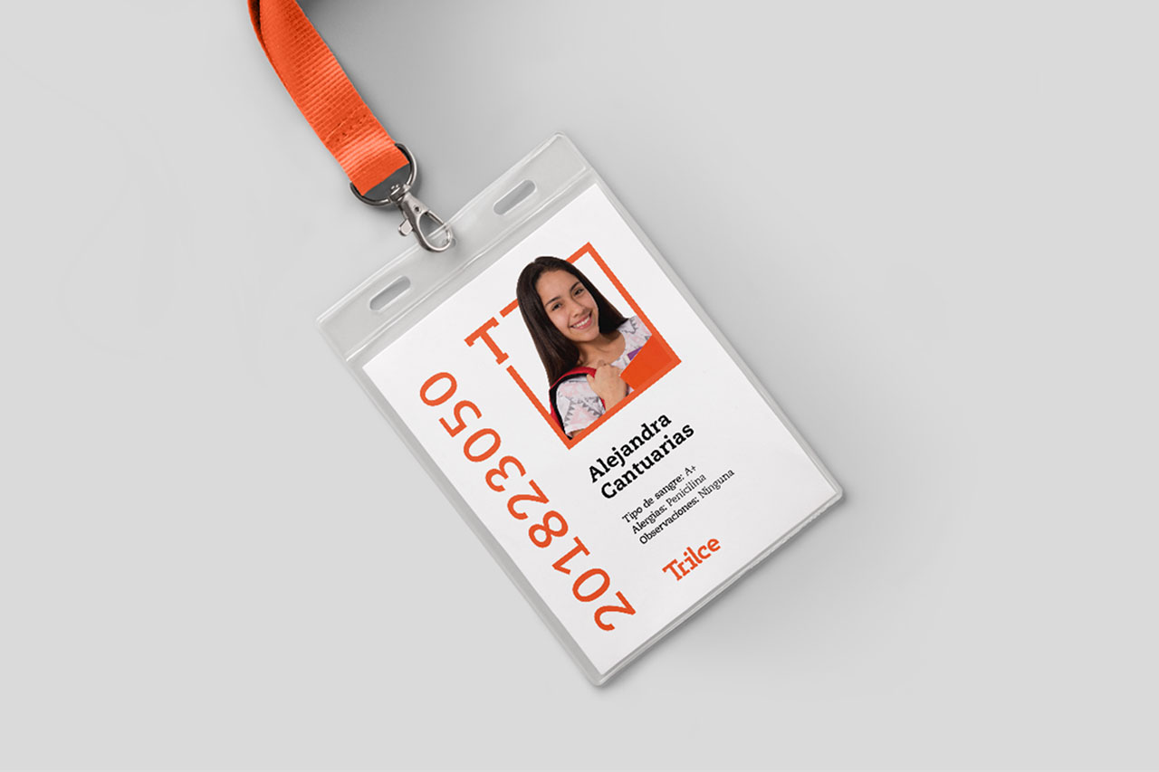
In this way, Trilce’s identity system is born from the letter T, which proposes a conceptual framework that interacts and is challenged by the images that show us students willing to overcome any limit and go further.
The system also proposes maintaining the brand’s main equity, the color orange, which together with white constitute an organized color palette to differentiate the identity and communications of their schools and their academies.
