Prima AFP
Identity
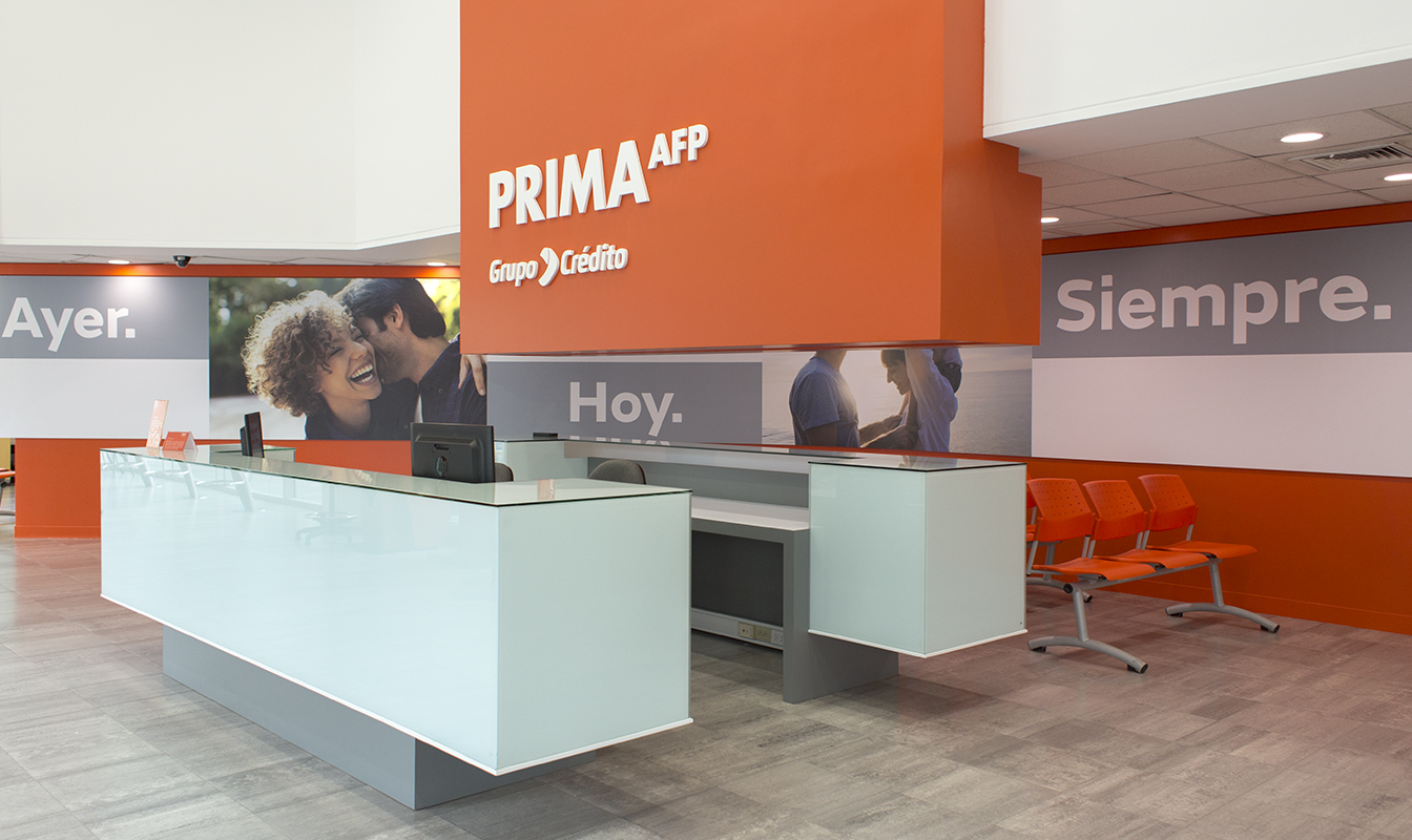
As part of its tenth anniversary, Prima AFP decided to refresh its brand identity through a modern and friendly language, in order to connect with its different audiences, keeping the commitment and dedication that has always characterized the company.
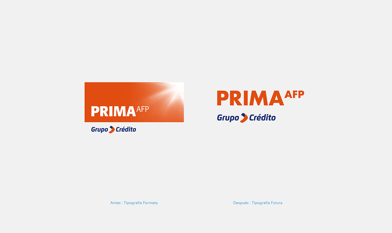
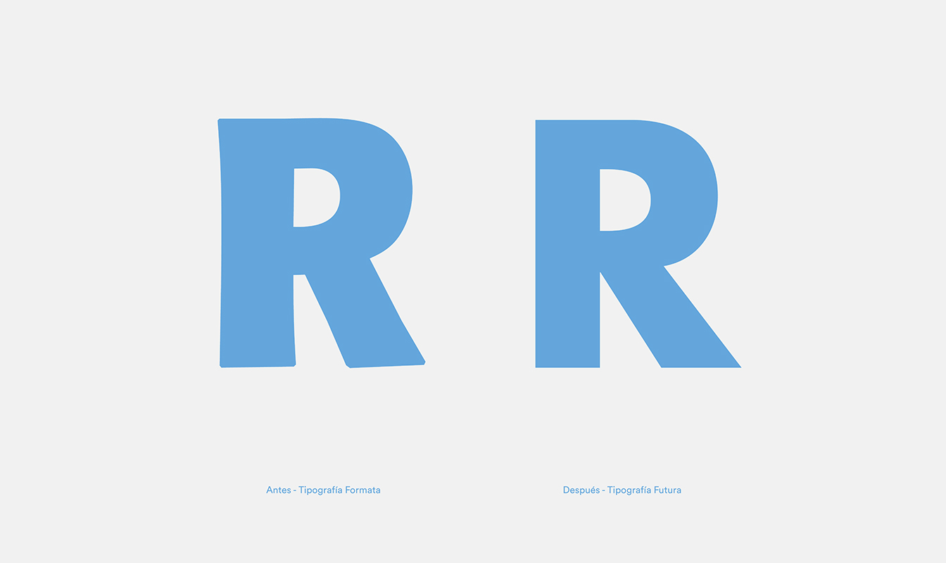
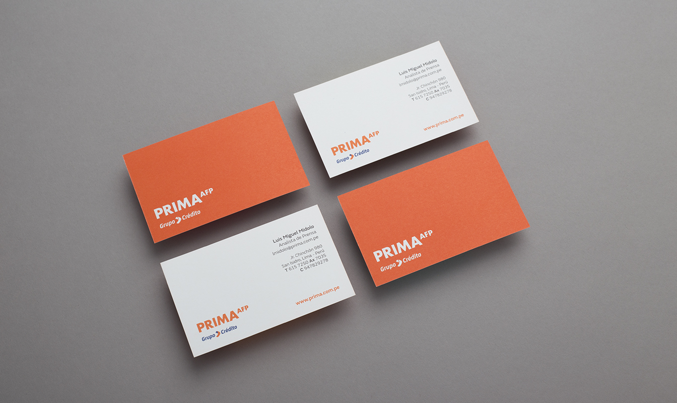
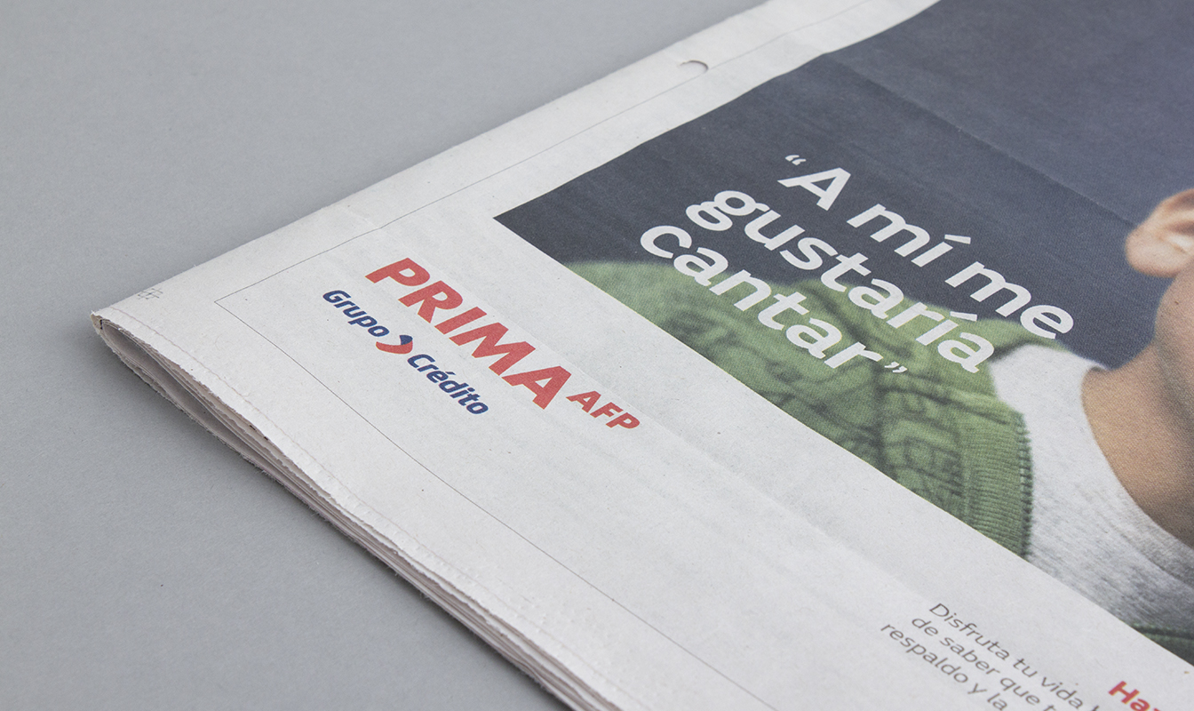
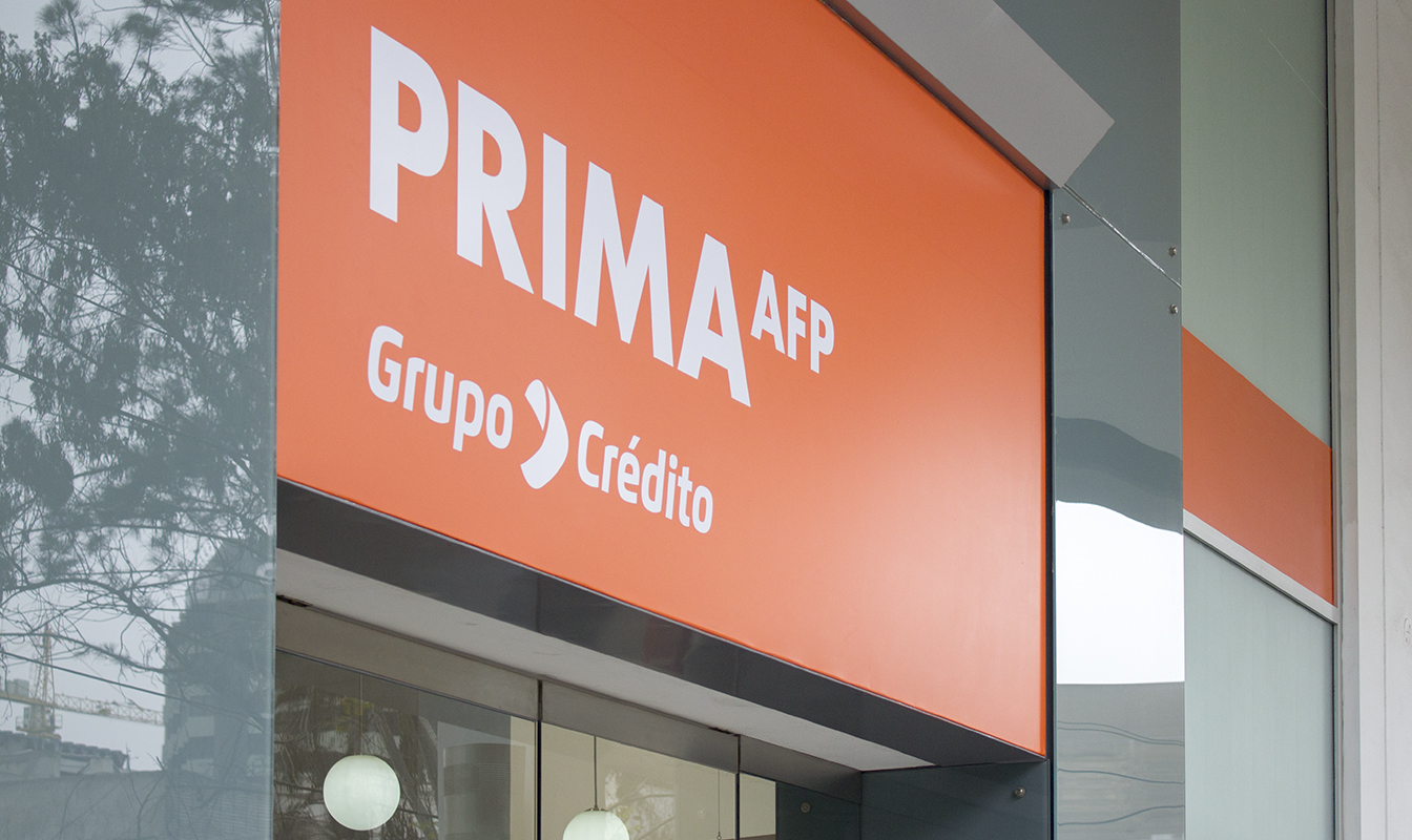
Thus, under a more dynamic and friendly concept, we worked with the idea of ”partners for your future”, reflecting the expertise and concern of the company for the future of its clients, and aiming to build a trusting relationship. For the redesign, we minimally updated the logo typography, but a whole new visual universe, that gives more presence and simplicity to the brand, was developed.
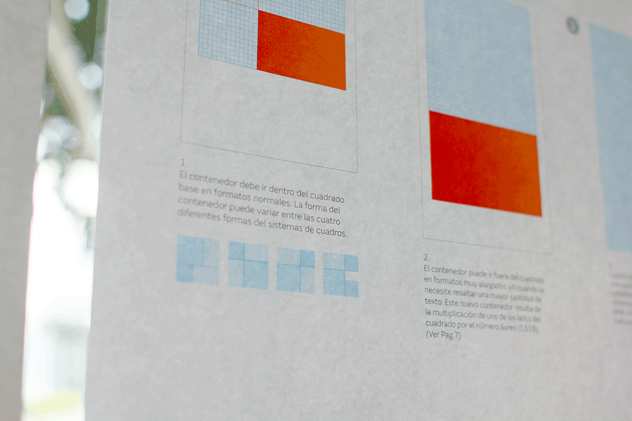
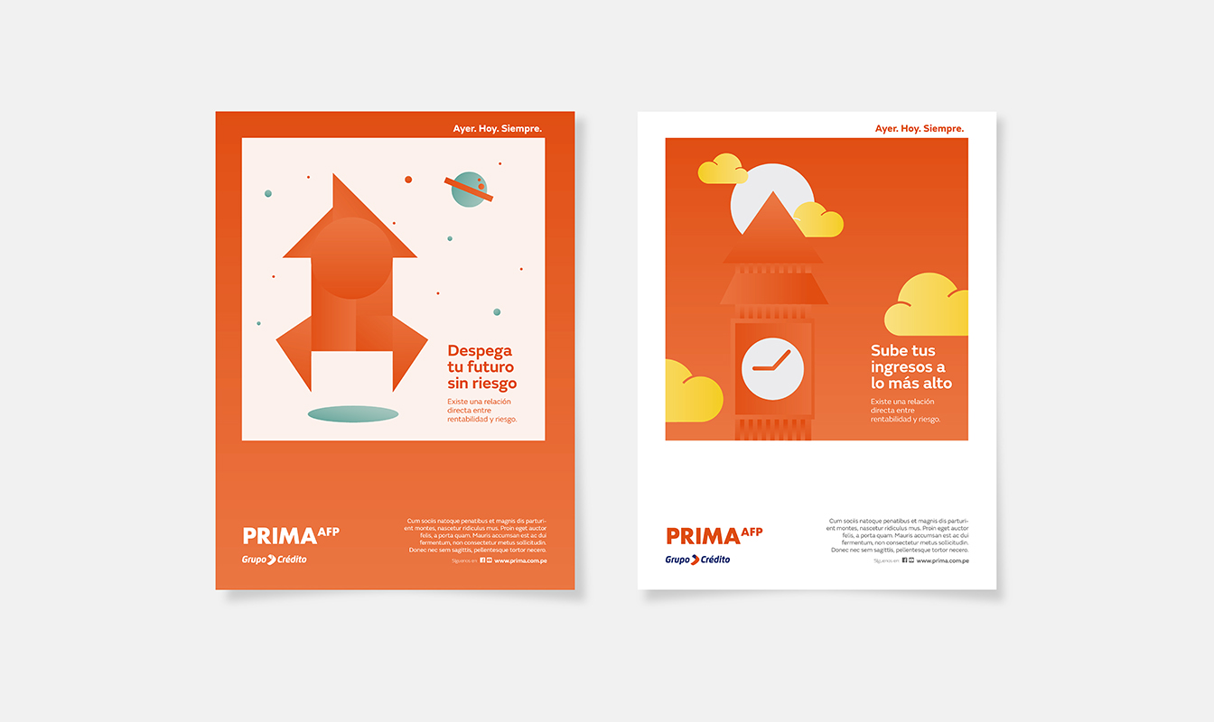
A good use of white, with golden proportions, was the key for organizing a more contemporary and functional layouts system, which gives coherence and visibility to the brand.
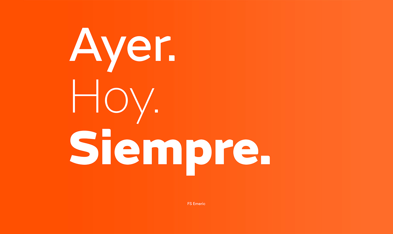
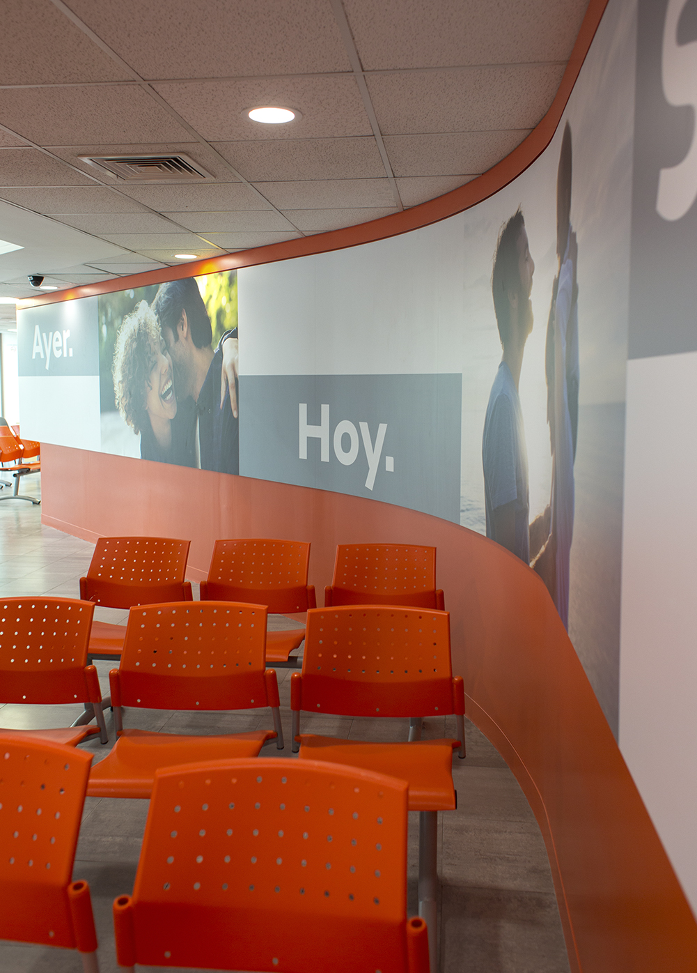
In this subtle rebranding, we opted to remove the flash from the old logo, in order to transfer all that warmth to the visual style. Through new colors / gradients and a new and very specific photographic style, we created a language that stands out for its simplicity.
