Monterey_1980
Identity
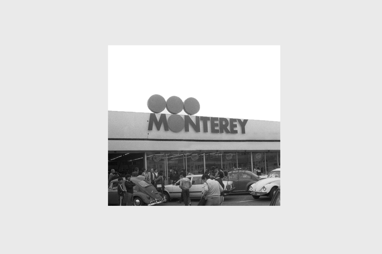
Monterey, one of the peruvian lovemarks, was a project that marked a before and after in the history of Peruvian design. Something to rescue, is that Monterey had the first brand manual made by a Peruvian company and we had the pleasure of taking the challenge of doing it.
Our story with Monterey began in 1980, when the brand sought to look and feel modern while maintaining its relevance and impact in the peruvian market.
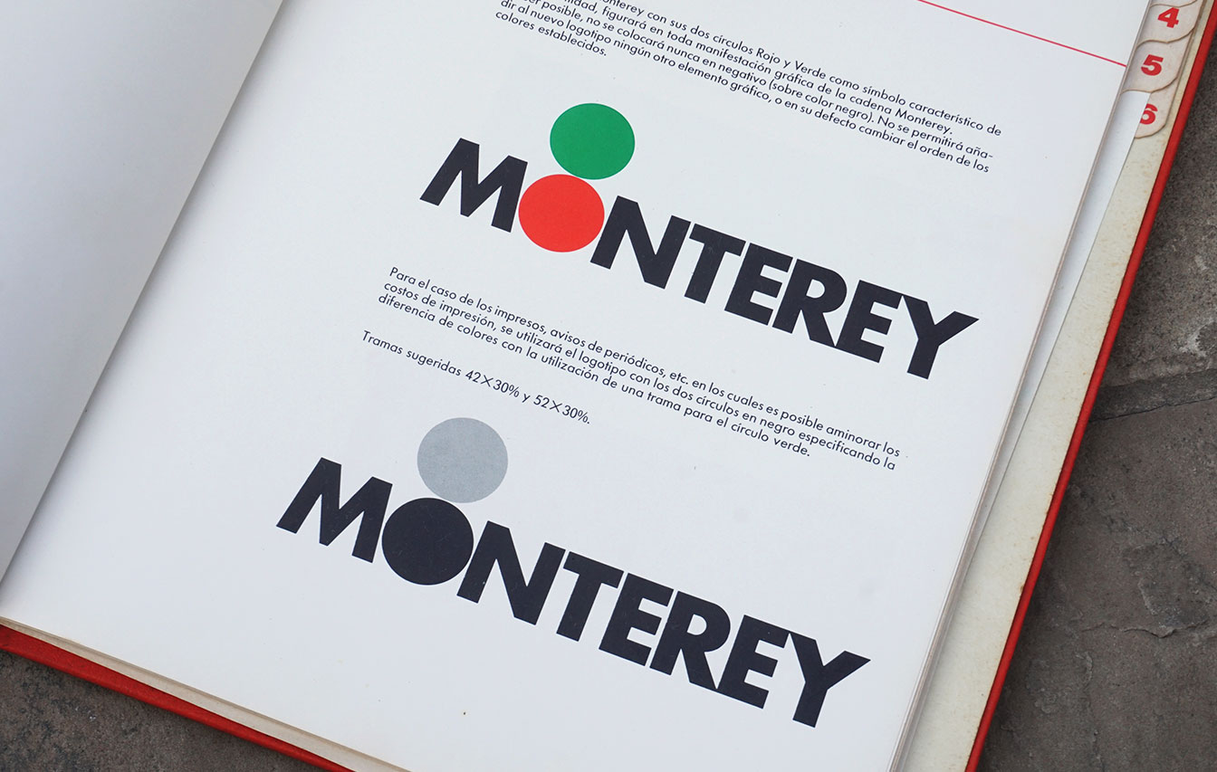
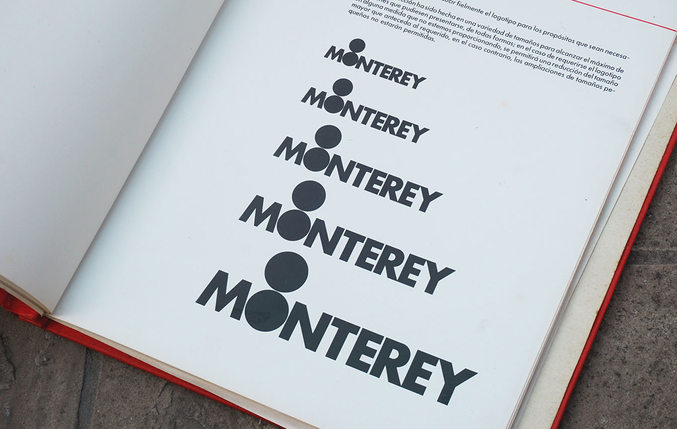
For this, we analyzed the different elements, deciding to re-interpret them, adding simple but striking elements such as the circles. This change of identity became part of our history, building a heritage of Peruvian design that still lives in the hearts of the community.
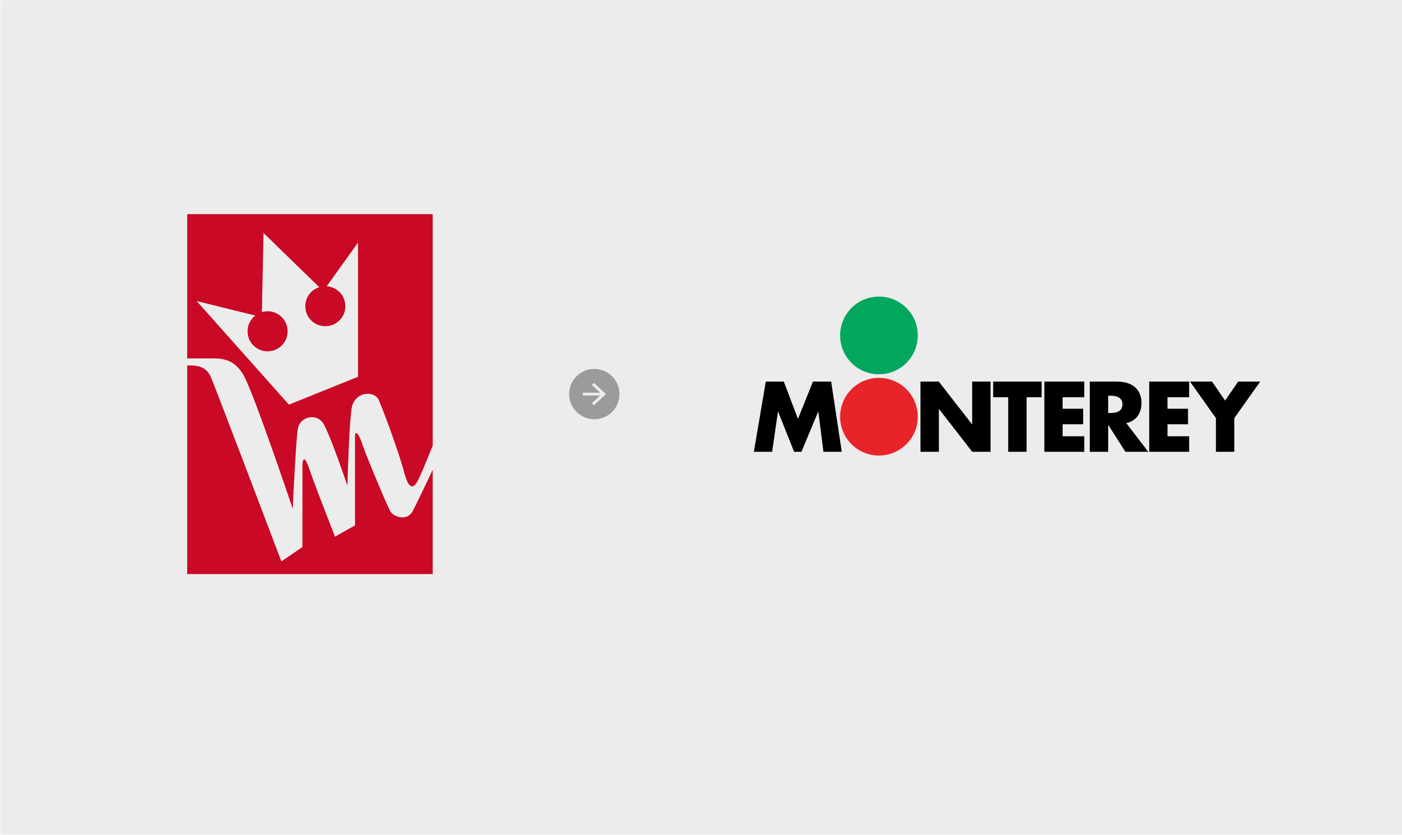
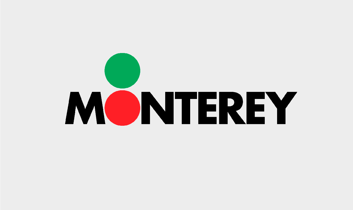
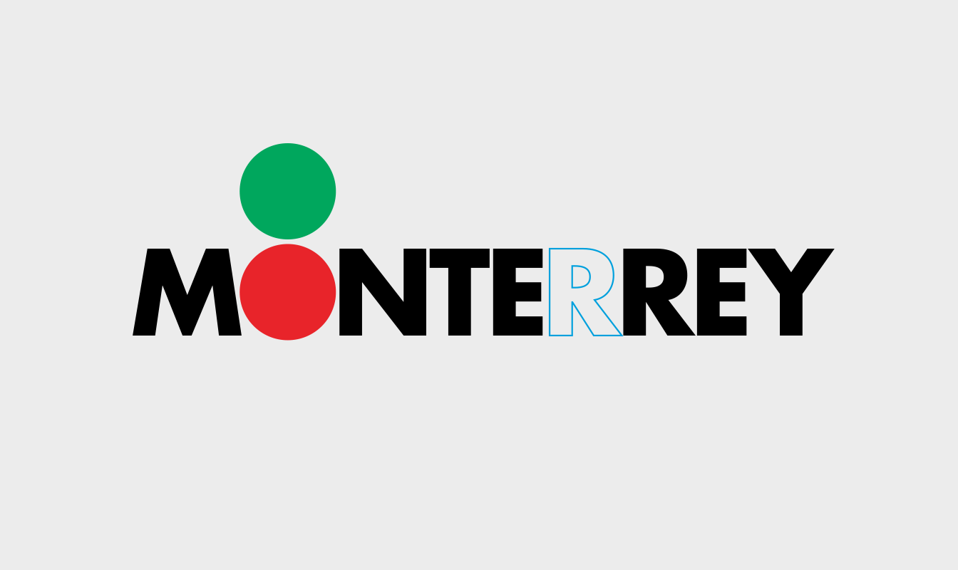
We recall our intervention in the elimination of an “R” in the name, a change that did not affect the reading of the logo and that was part of an internal campaign where the “R” was symbolically given to the company’s employees as a sign of the “Renovation” that Monterey was carrying out.
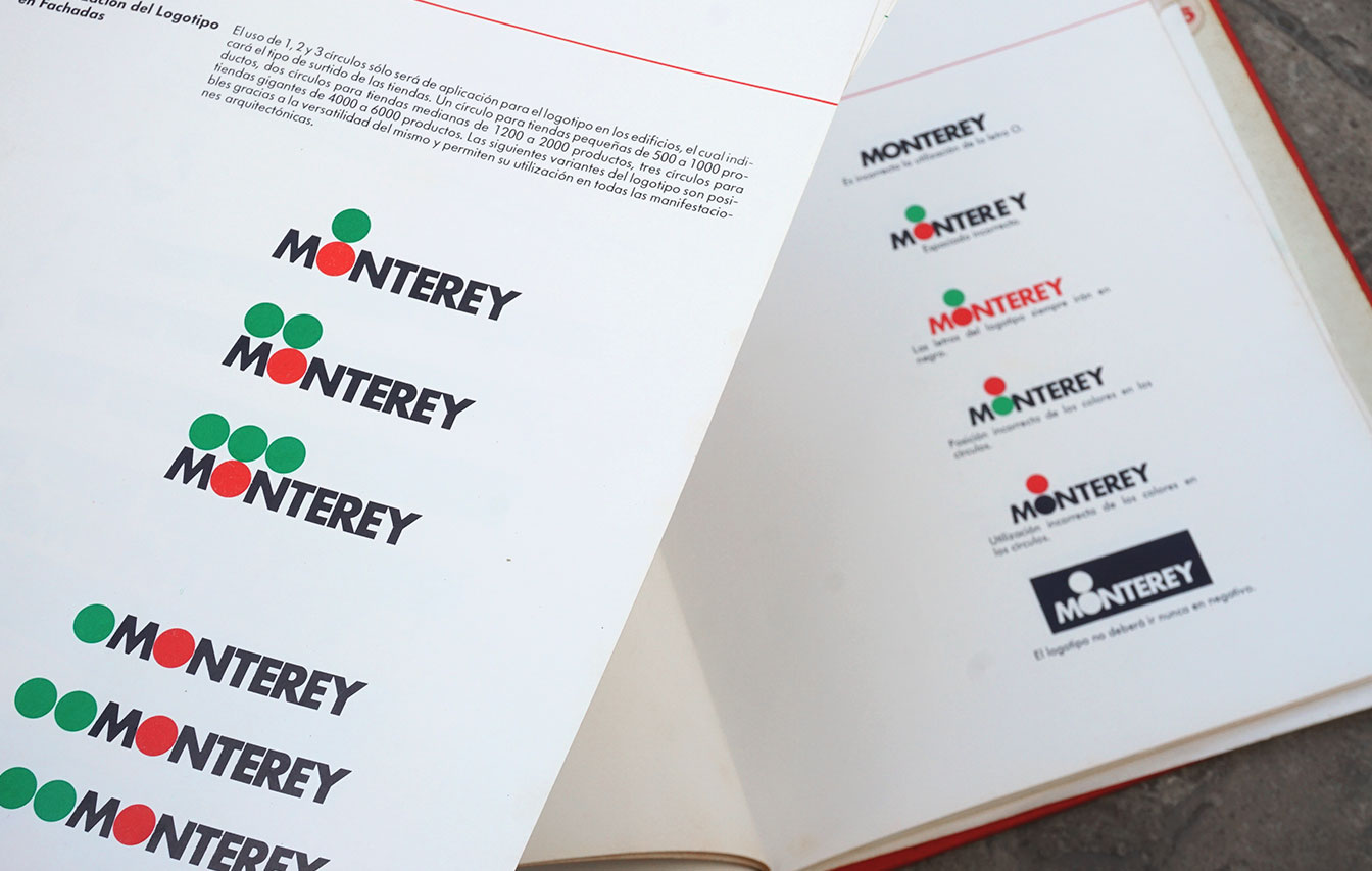
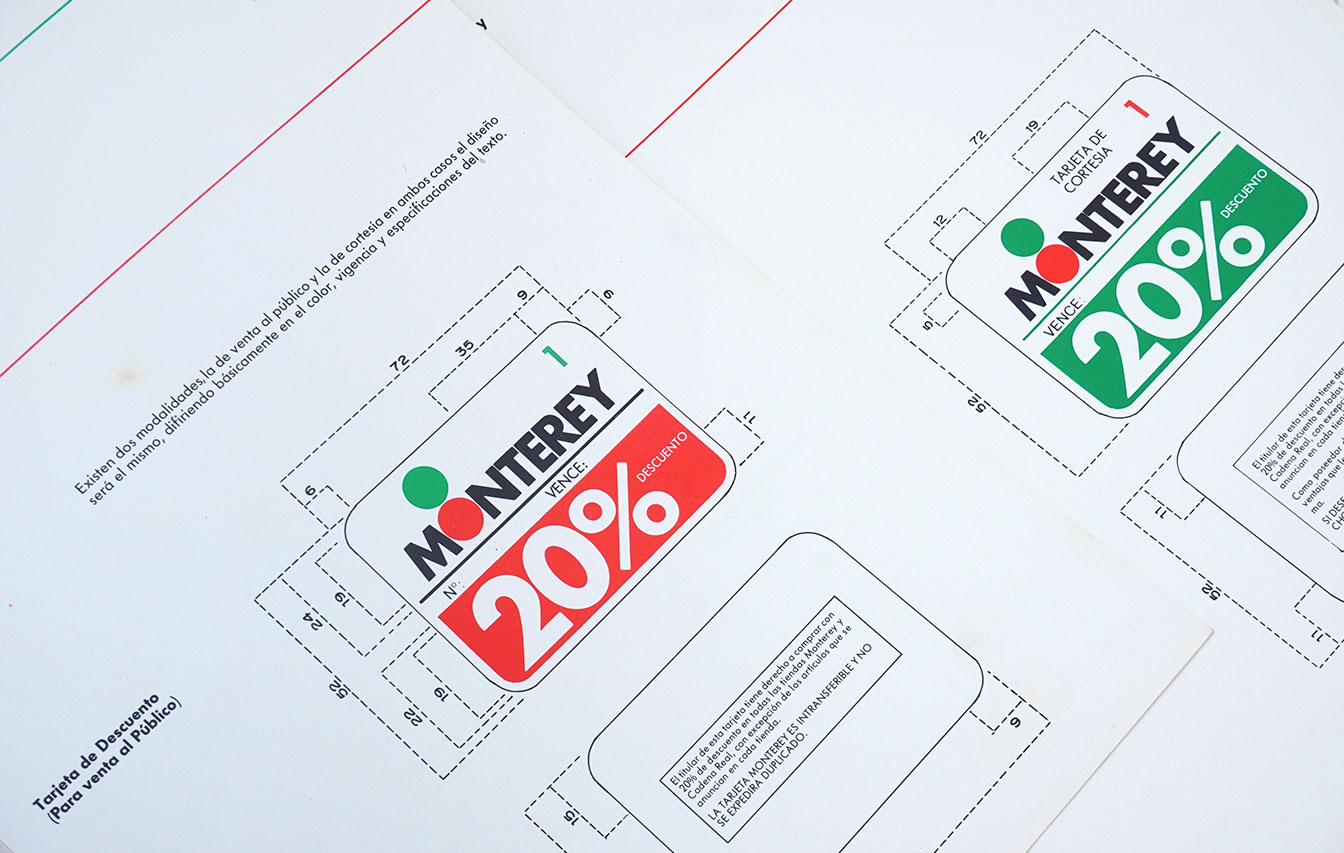
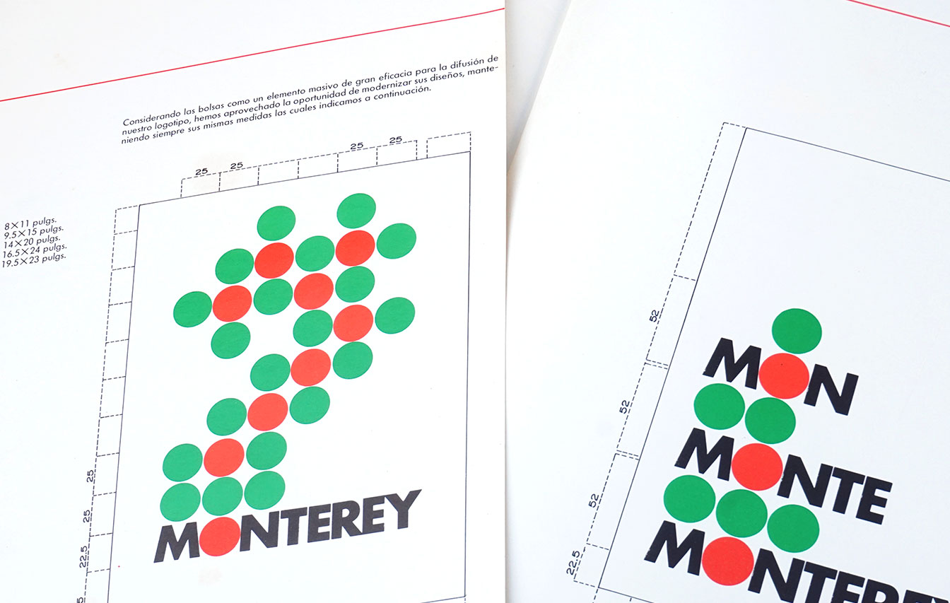
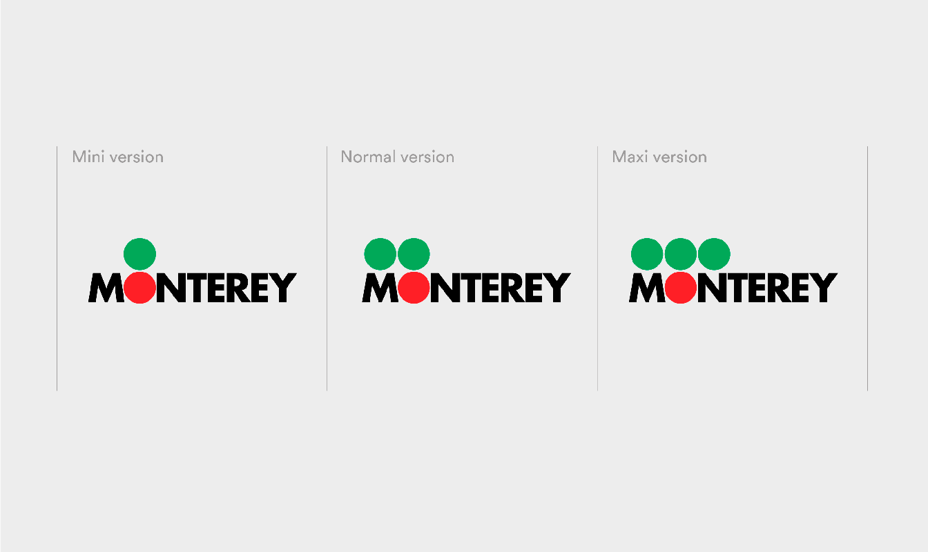
This brand book allowed us to remember when we decided to evolve the “crown” that was part of the brand and replace it with a system of green and red dots, which became an important resource for the organization of a brand architecture that told us about categories and store sizes.

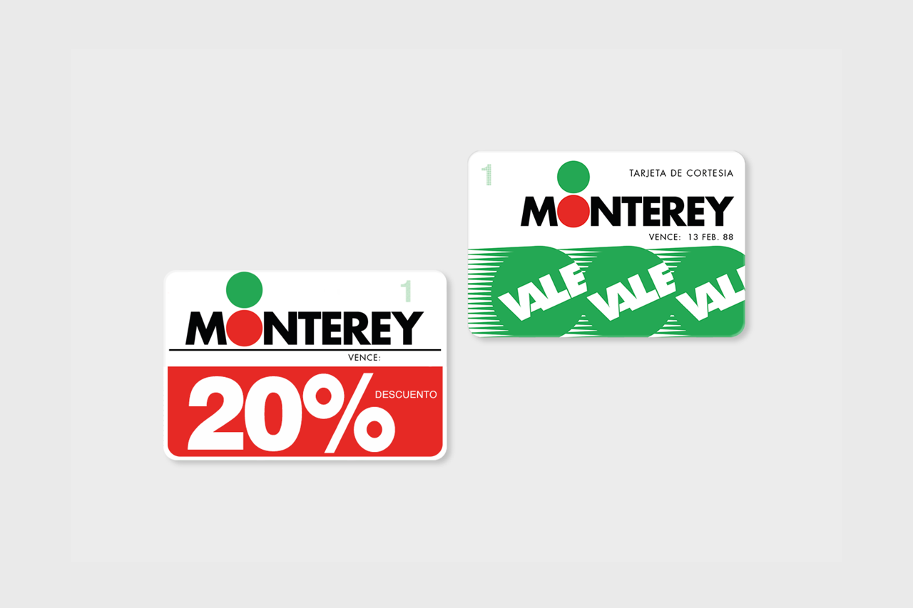
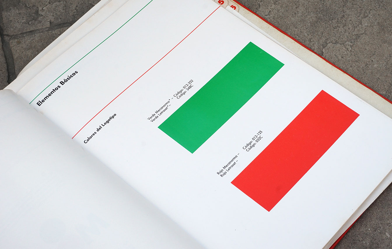
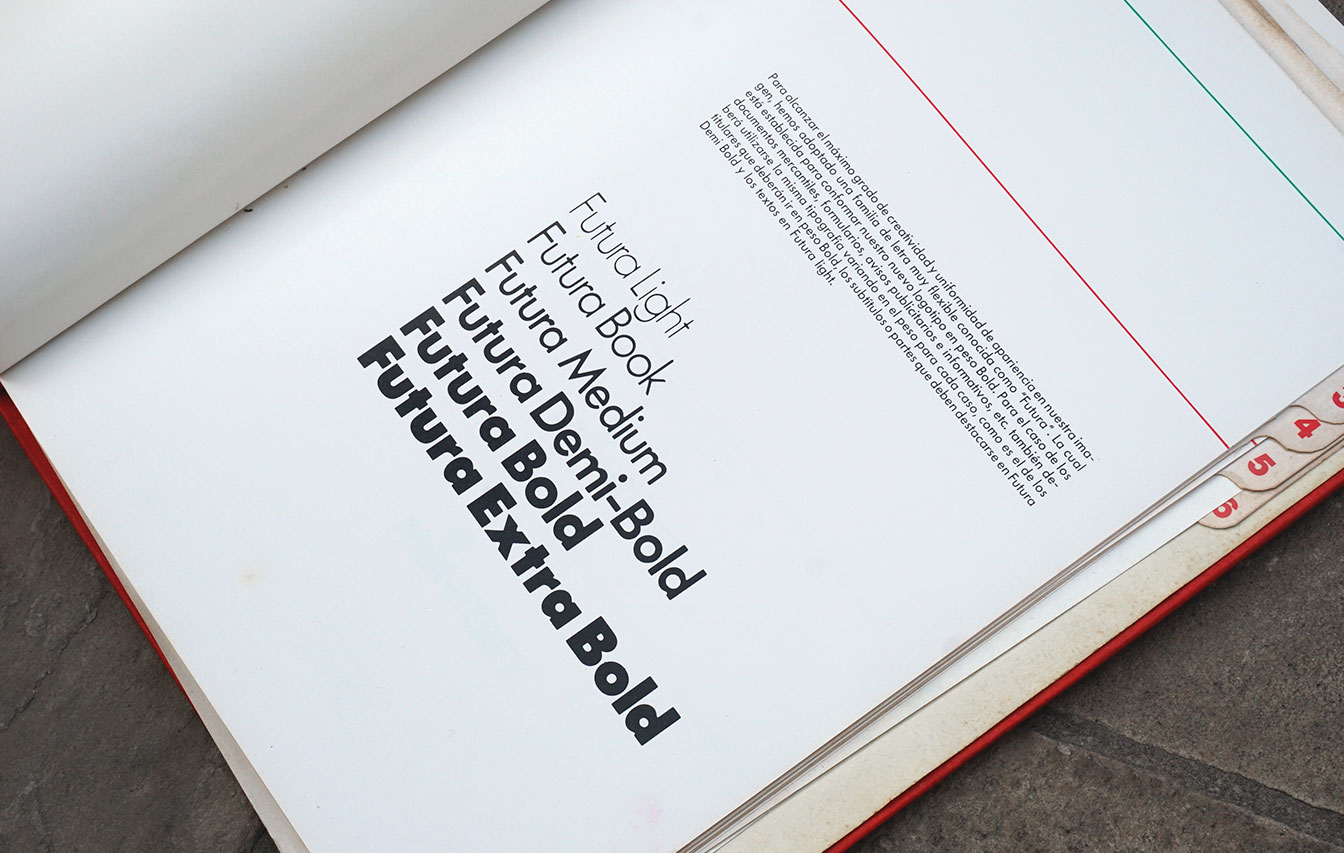
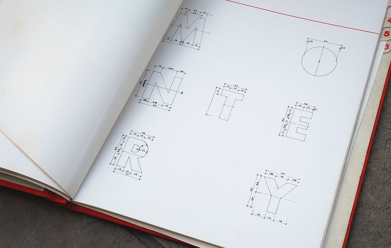
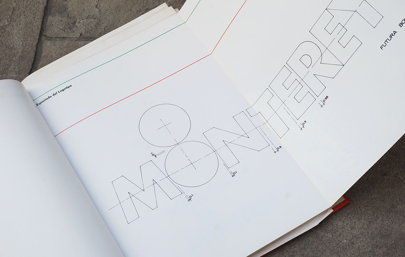
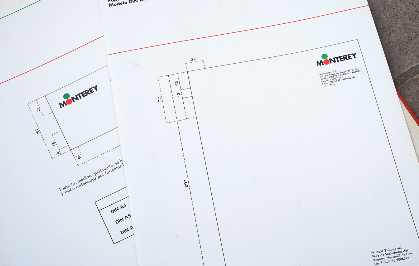
Slideshow of the internal pages of the brand book, where the logo, colors, typography and sizes are explained.
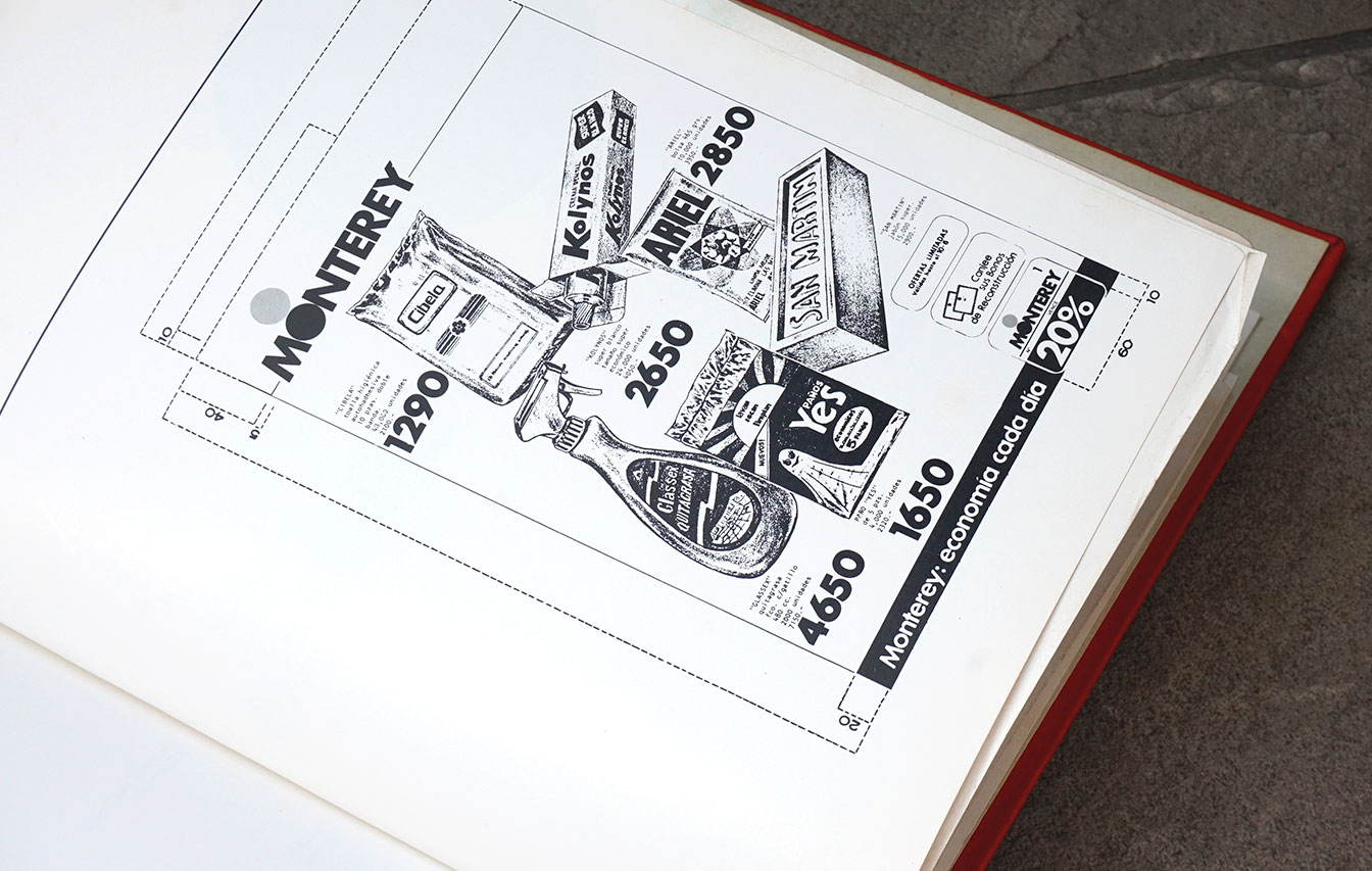
Slideshow with more specific and detailed graphic artworks.
