Limaná
Identity
Limana is a restaurant that was born with a flexitarian proposal and a philosophy that cultivates respect and balance between people, animals and nature. Under the brand concept “Pleasure without guilt”, Limana delivers a delicious cuisine that teaches us to eat better without sacrificing the pleasure of a delicious meal.
Limana is a restaurant where balance is what prevails, where there is pleasure and enjoyment but above all there is a balance and awareness of its impact on the world.
Being balance our starting point, we explored different graphic interpretations, until we were left with the simplest and most complete of all: the circle. The circle symbolizes and synthesizes the integration of the human being with his environment, the beginning and the end of life, the earth and the sky.
But also and even more important, the union of the spiritual in relation to the material. Our circle becomes an element that migrates around our logos and our graphic pieces accompanied by two colors: red for passion and light blue for inner peace.


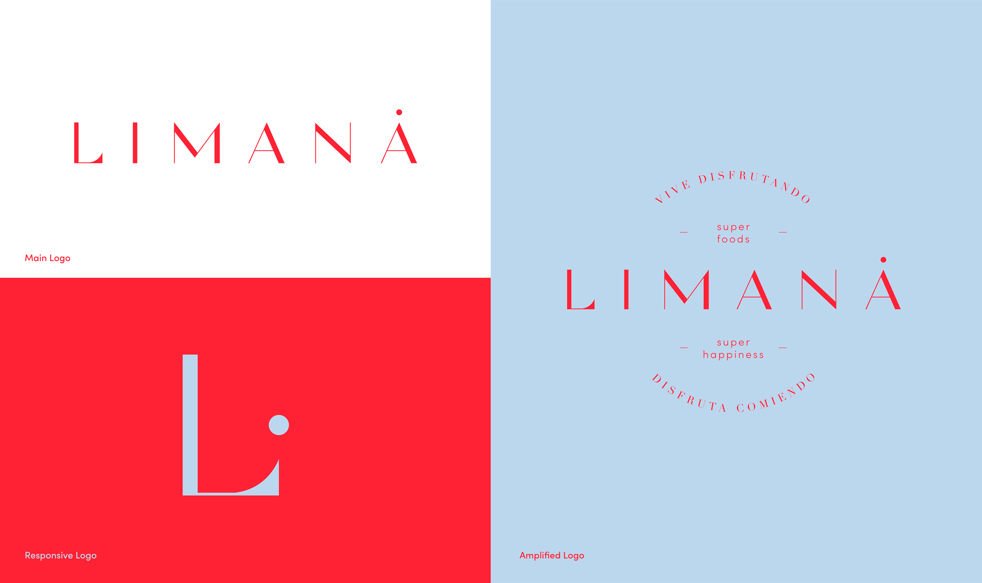
Our main logo features a san serif typography, accompanied by our circle, present as an accent mark in the final letter A and then becomes a detail in the letter L, which becomes our symbol and responsive version.


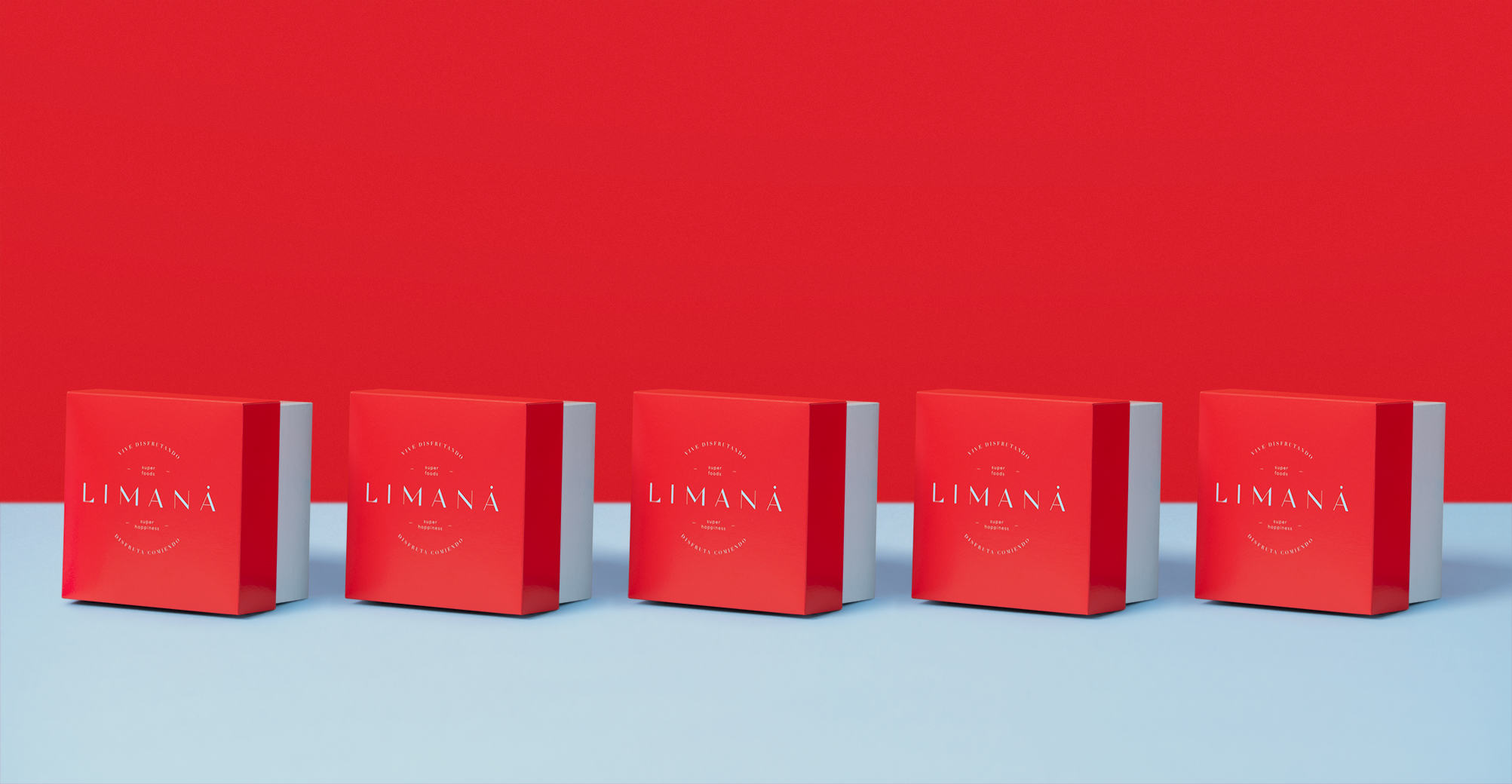
Appealing to growth and impact, we made an expanded logo, a larger version that has different messages integrated in a circular shape. Around the identity the two colors of the brand live with our logo versions, adding circular compositions and messages, which appeal to that precision and attention to detail. Limana is a complete experience, starting with the dish served, the space and even the delivery service, without leaving aside the human strength behind every detail. A place where you not only enjoy, but you are aware that what you consume has a positive impact on you and the environment, giving you physical and mental satisfaction.


