Interbank
card system
Identity
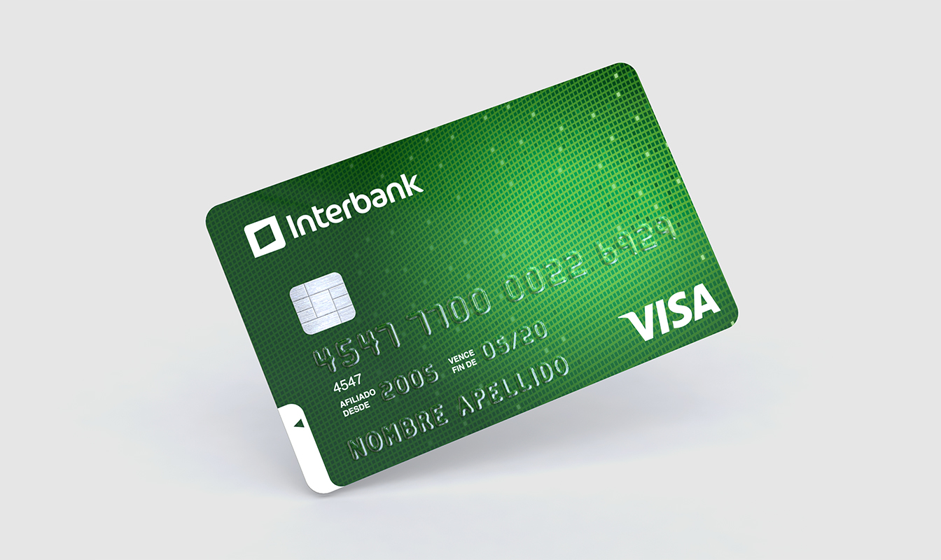
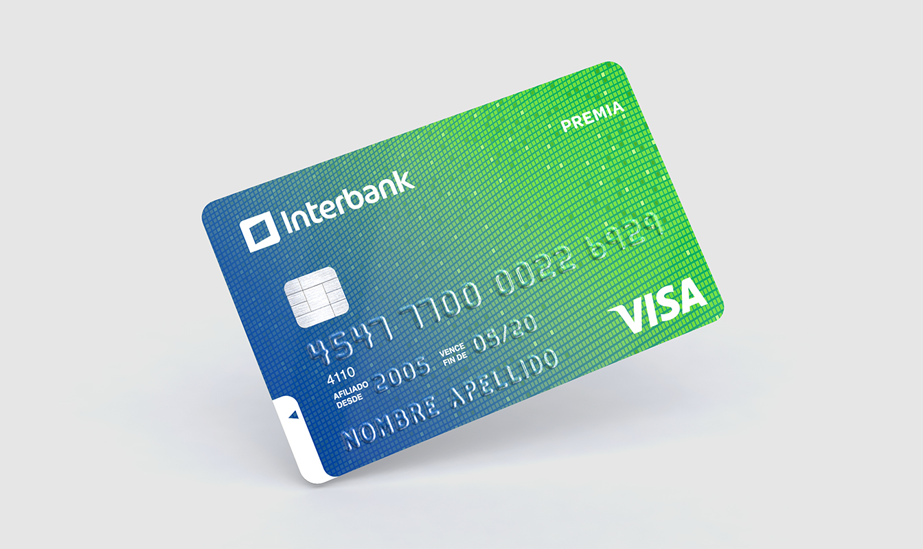
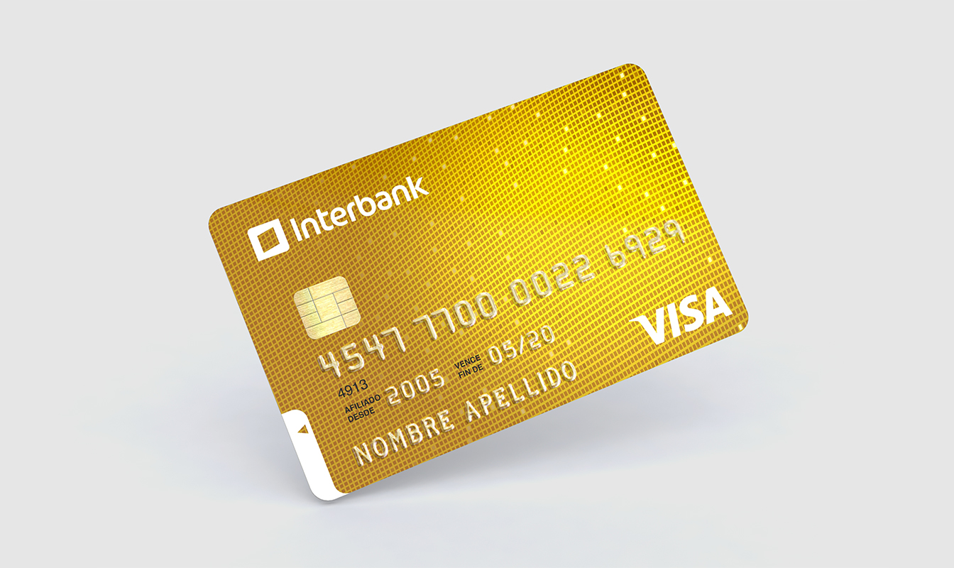
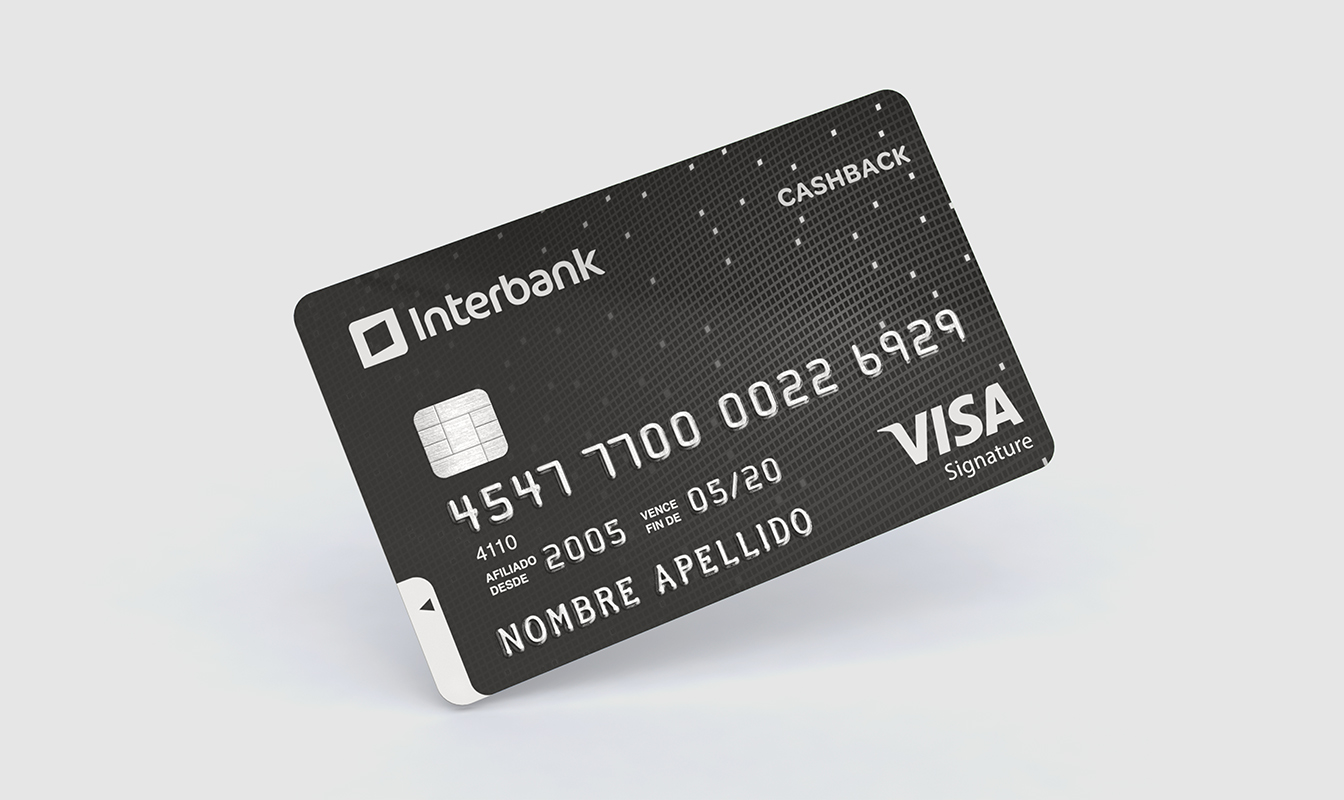
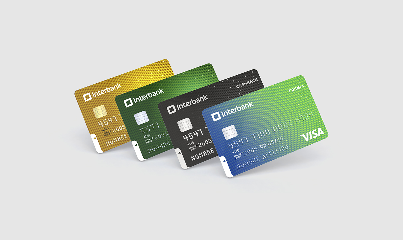
In a highly competitive sector like banking, where brand relevance and differentiation is vital to reach more customers, Interbank saw the need to redesign its portfolio of credit and debit cards, in order to project the main attributes of the brand: innovation and modernity.
The project was to convey the vitality, dynamism and energy of the brand, without losing its status or proximity to its customers.
In the world of credit cards, it’s very common to find textures and generic images that don’t communicate anything nor are anchored to the brand.
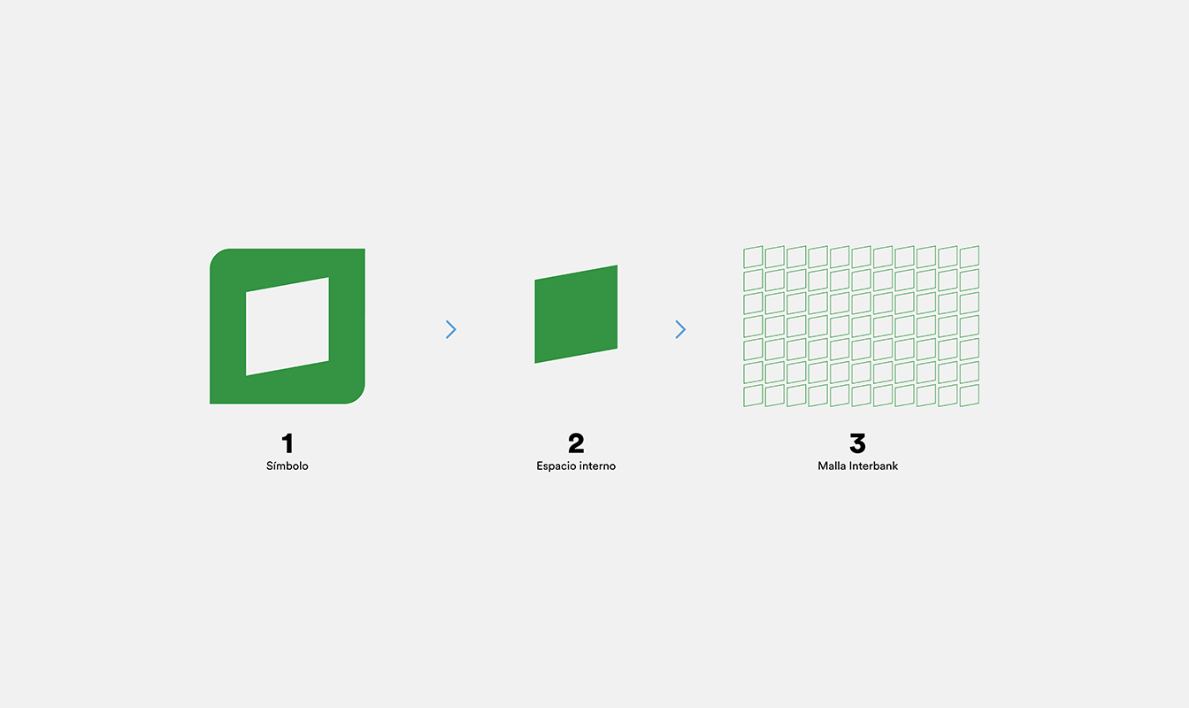
For that reason, we worked a unique texture that draws from Interbank’s isotype, to create an own mesh that differentiates it from the rest and builds a well-ordered cards portoflio, which gives off energy and movement.
