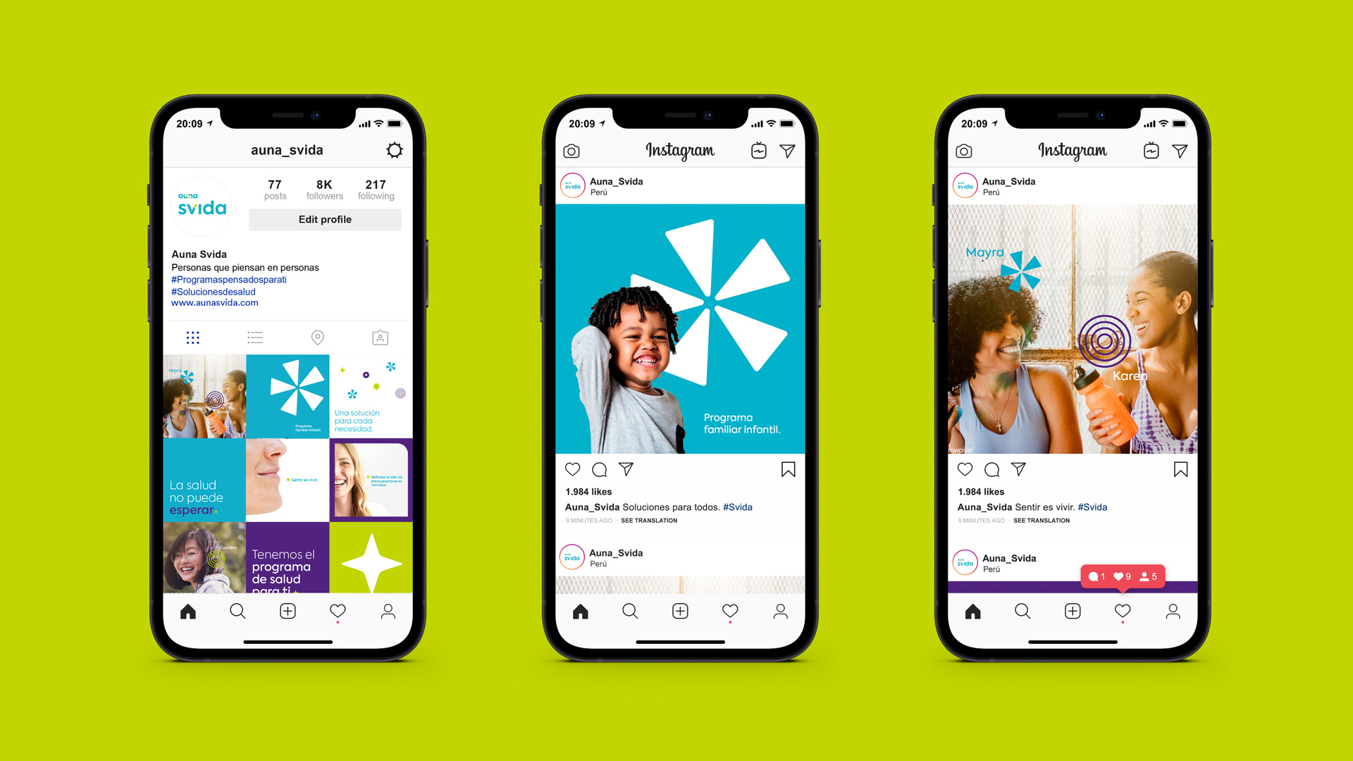
Auna Svida
Identity
Auna, the leading health network in the peruvian market, decided to diversify and launch a new brand for its complementary health programs. This is how Auna Svida was born, a brand that starting with the naming, emphasizes the most important thing for Auna: life and people.
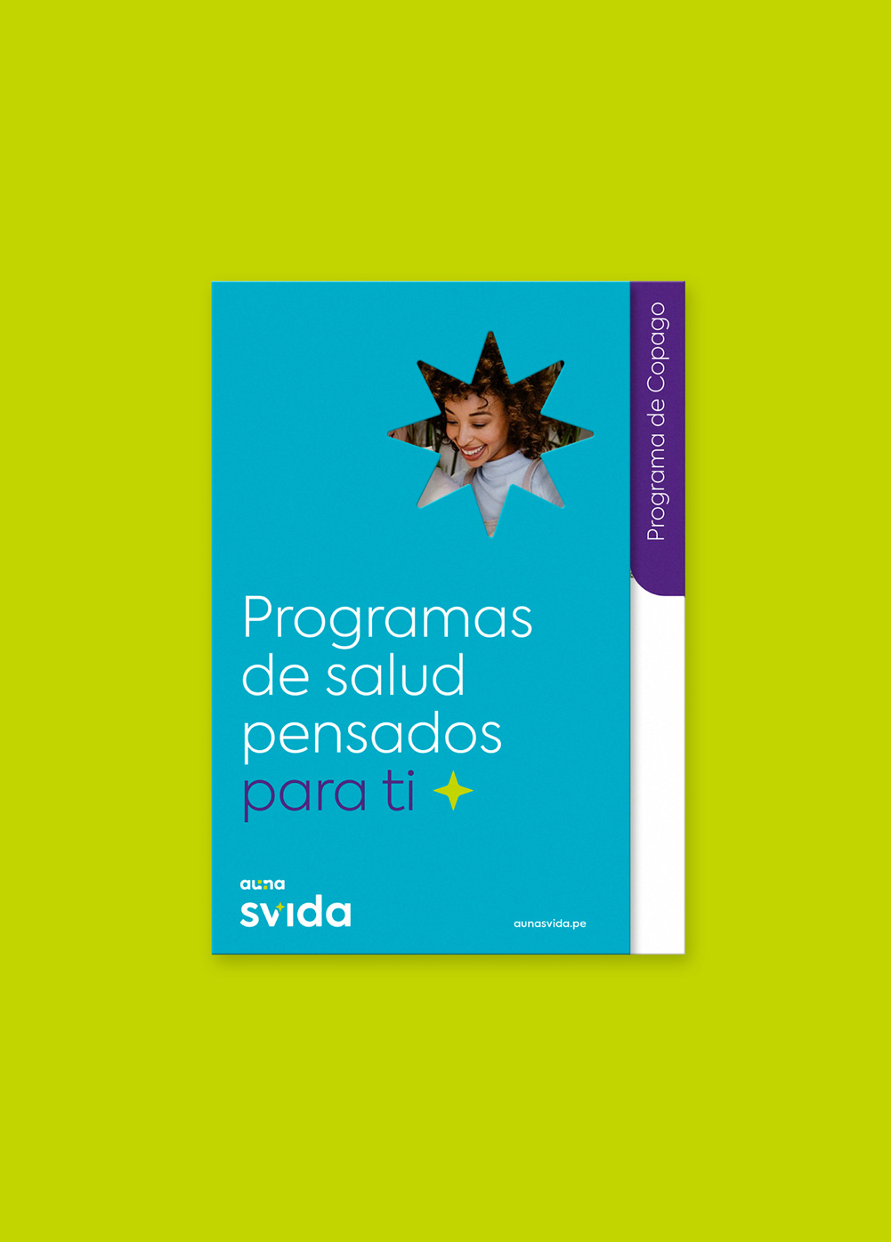
With people at the center, we took as inspiration that unique light that each person has to express themselves, to enjoy and to live; a glow that is generated from the counterform of the logo of the masterbrand, and that changes to different forms, representing that unique and unrepeatable light in each person.
In our chromatic palette we share the colors of Auna, adding the purple that brings modernity and contrast. The way of communicating is also important, so Auna Svida has a close and human verbal communication that is in its various communications. This, together with the photographic style achieve a playful, close and emotional identity.


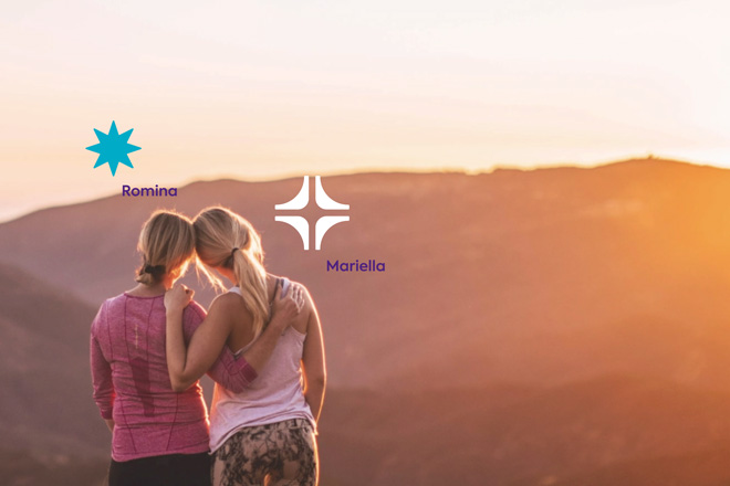
We have different glows that represent that unique and unrepeatable light that each person has.



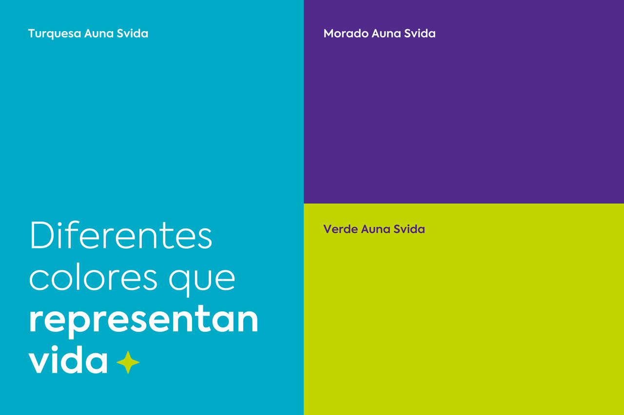
A human brand with a bright and fun palette that connects with the Auna master brand.
The purple works as a contrast bringing modernity and closeness.
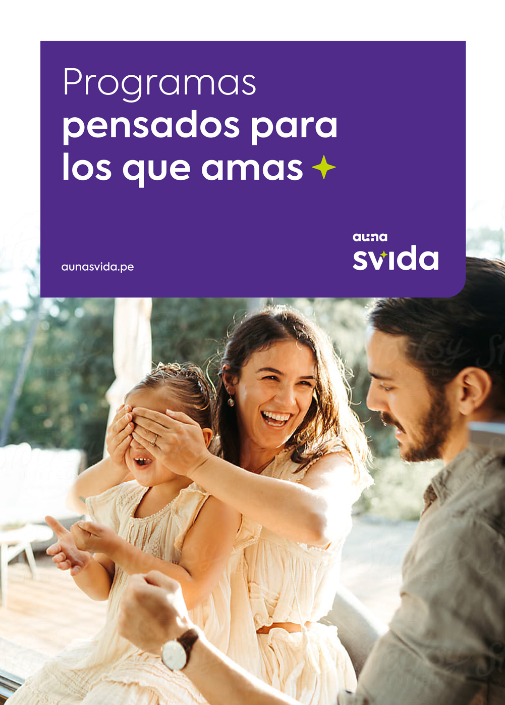
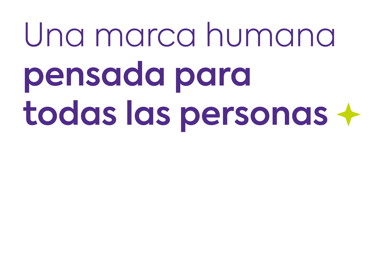
Around the different communications, the glow changes and adapts, moving around the identity, also working as an end point in the different sentences. In addition, the verbal style is close, bringing humanity to the brand.
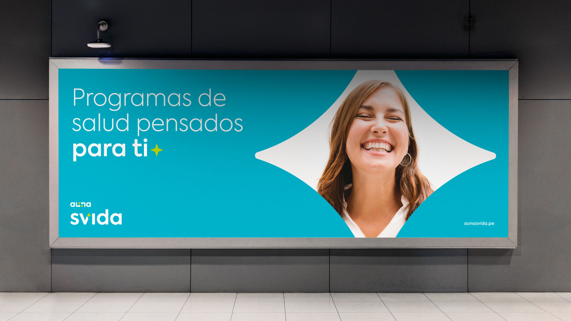
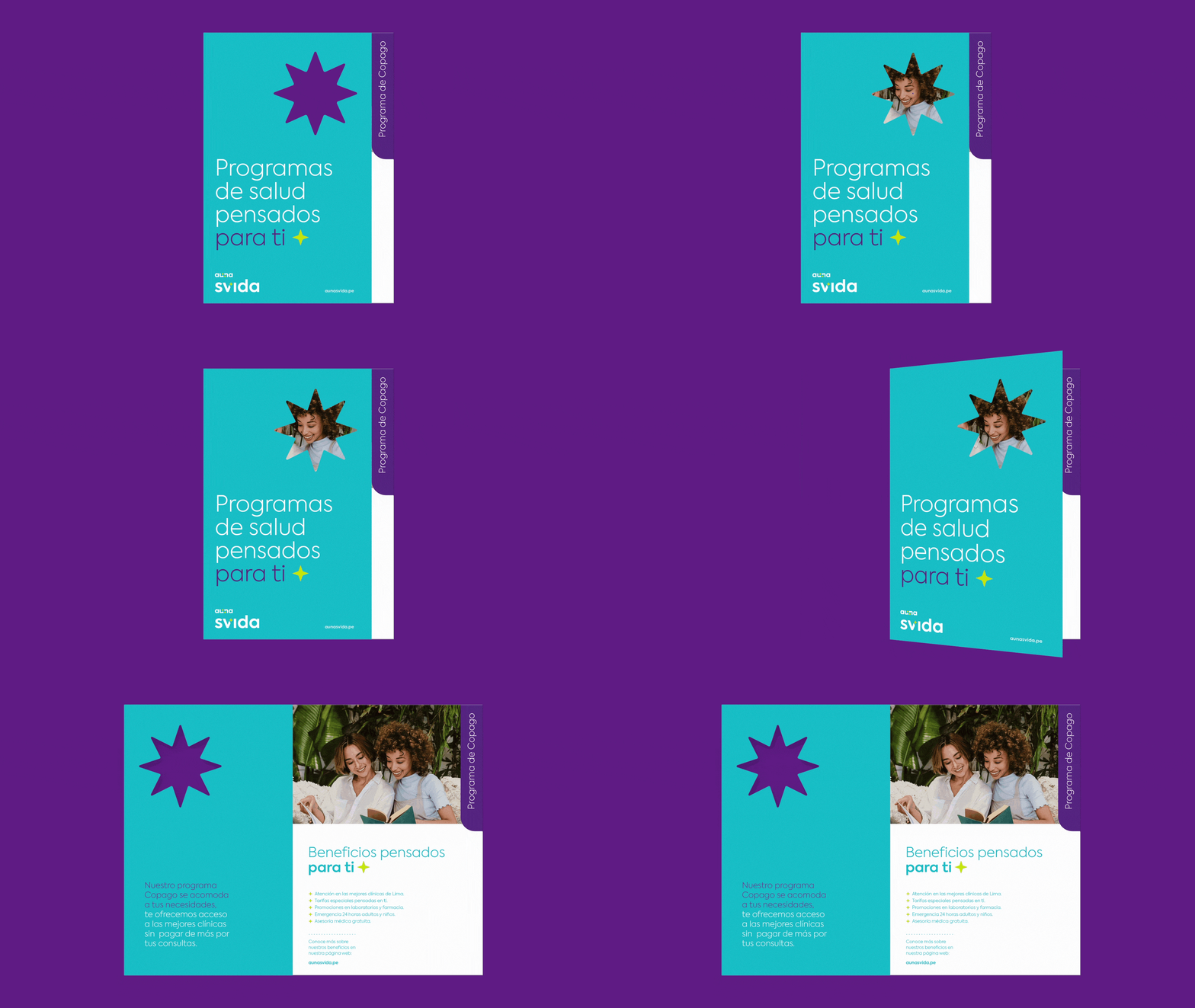
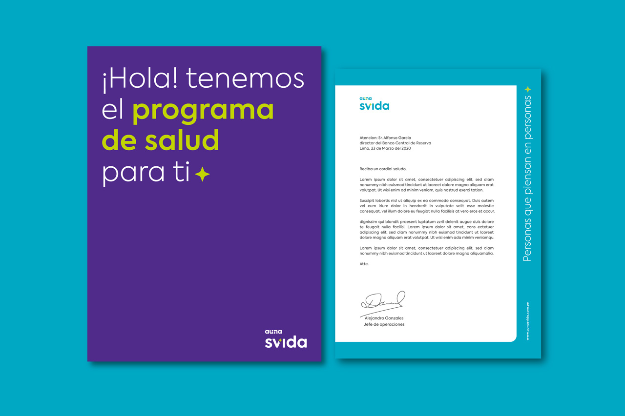
It is the people and their lifestyles that inspire this identity.
