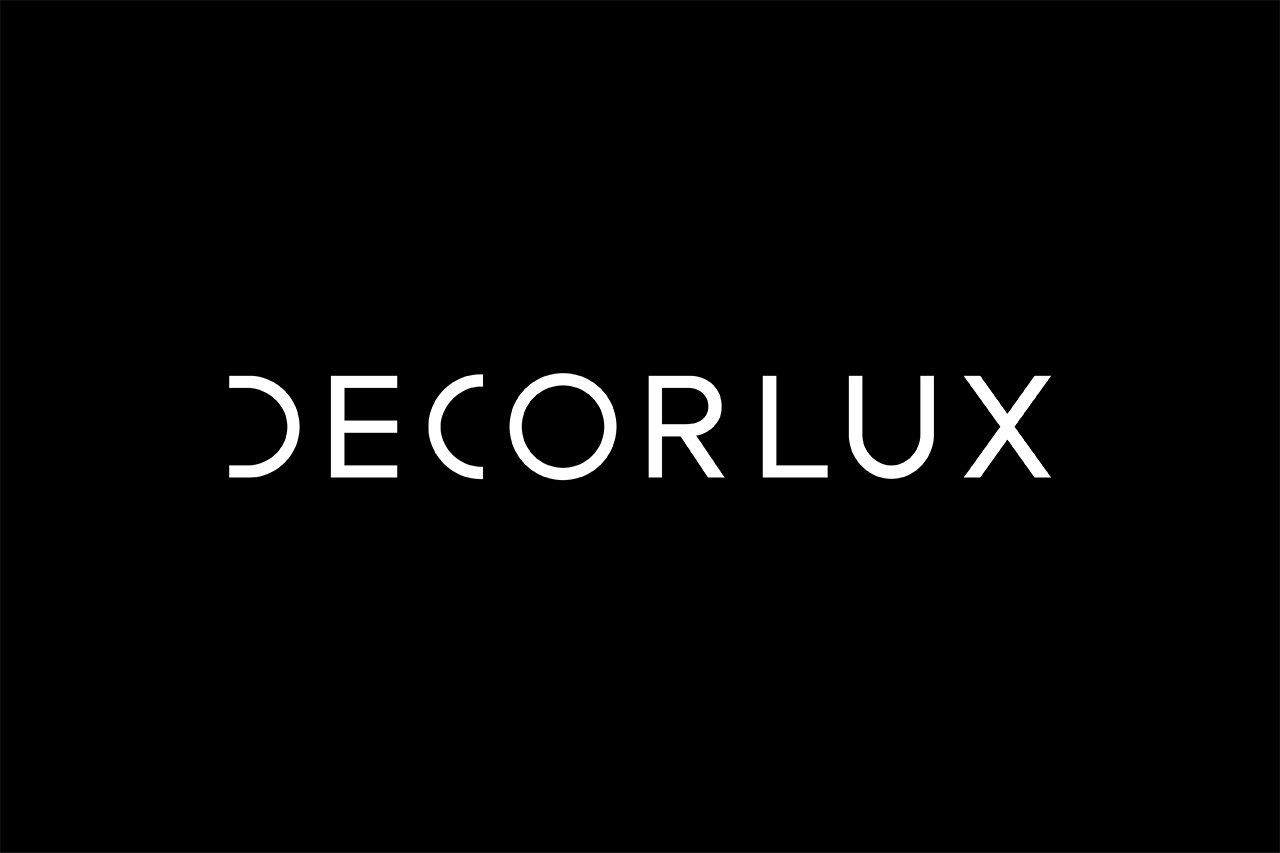
DECORLUX
Identity
Decorlux, a regional reference in interior design, decided to evolve its visual identity on the occasion of its 30th anniversary. So we embarked on this project starting with the definition of its brand strategy.
Under the central concept “Beyond excellence”, we seek to highlight the passion and commitment of Decorlux to take every space and every detail to its maximum potential, always exceeding all expectations.


Decorlux is distinguished by its minimalism and sophistication, using simple shapes around its different products. We were inspired by this simplicity of shapes in the construction of the logo, using a clean, modern and elegant typography where the circle and half circle stand out. Within our identity these shapes; the line, the triangle, the square and the circle, are the main characters. For the color palette we chose black to represent the elegance, simplicity and technology of Decorlux and the pastel pink color represents the humanity and closeness of the brand.
A responsive logo was developed, where the D of Decorlux is descended and raised to the power of X, joining the first and last letter of our logo, representing the “beginning and end of the details” as well as reinforcing the power, strength and versatility of the brand.


