Quality Products
Identity
Quality Products, a Peruvian brand founded in the 1990s, marked an era in Peruvian television, innovating with the entry of telesales into our lives. Since its beginnings, it has stood out for selling the “Quality” experience, a proposal of great quality, innovation and permanent contact with its customers. Today, Quality Productos decides to take a strategic leap to connect with new generations, modernizing its digital platforms, the main point of contact and purchase of its customers.
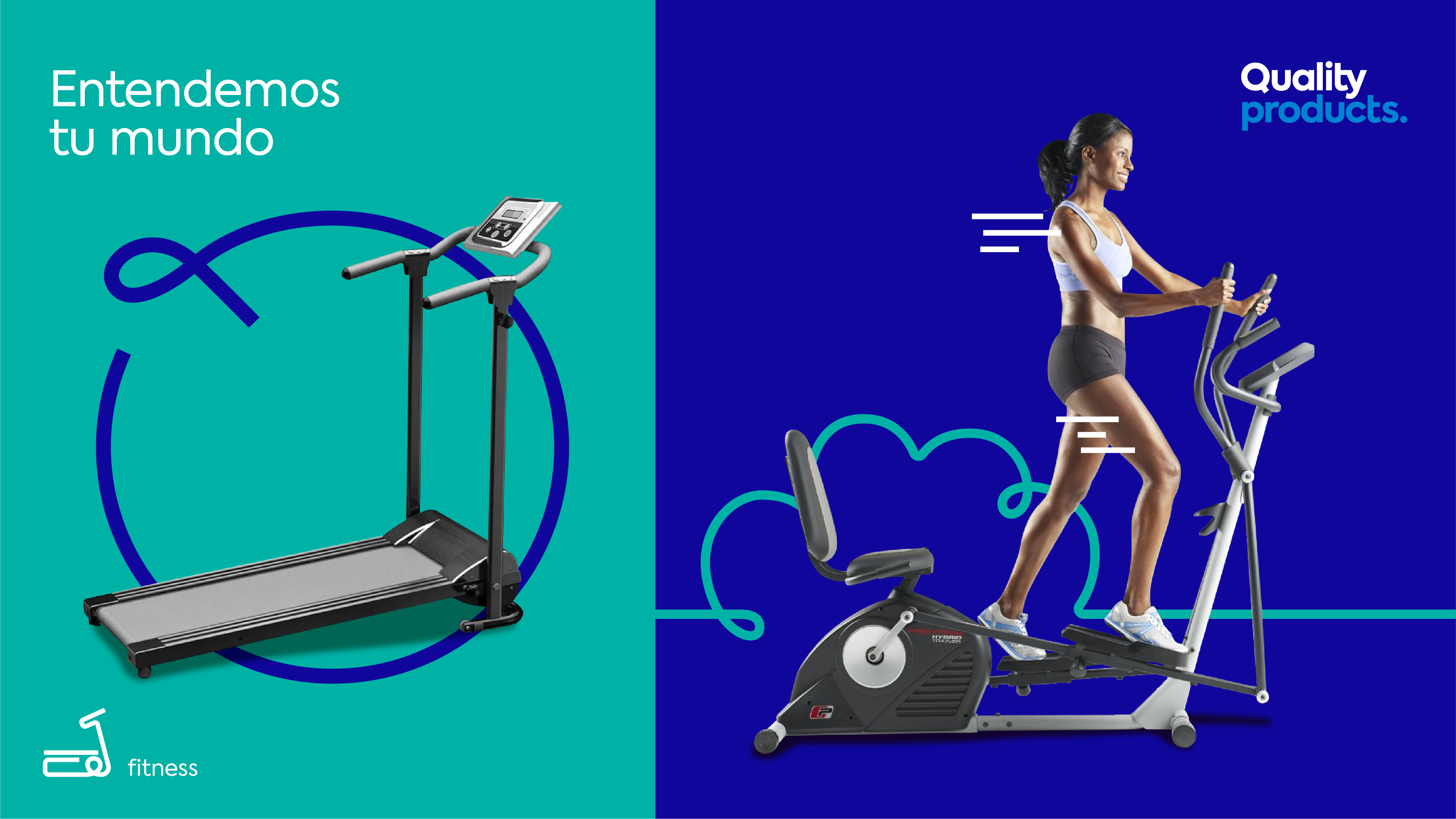
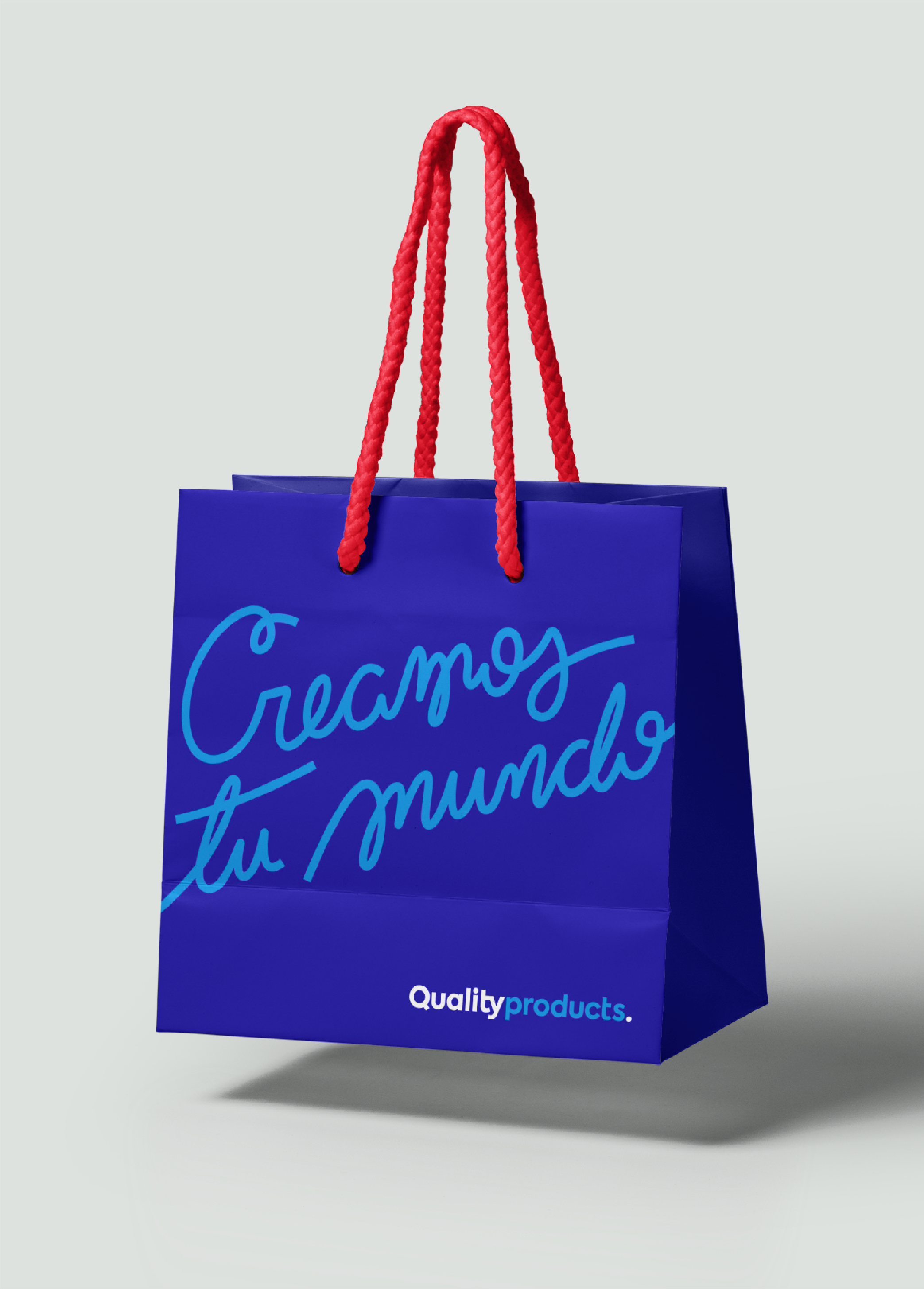
Under the concept “We understand your world”, the brand seeks to generate welfare and become the ally that optimizes and streamlines your tasks. Thus, a new corporate identity was developed, rescuing the color blue, present since its beginnings, which complemented with light blue, transmits youth and technology. In addition, a wide palette of colors was defined to express versatility, energy and dynamism to connect with the user and the product.

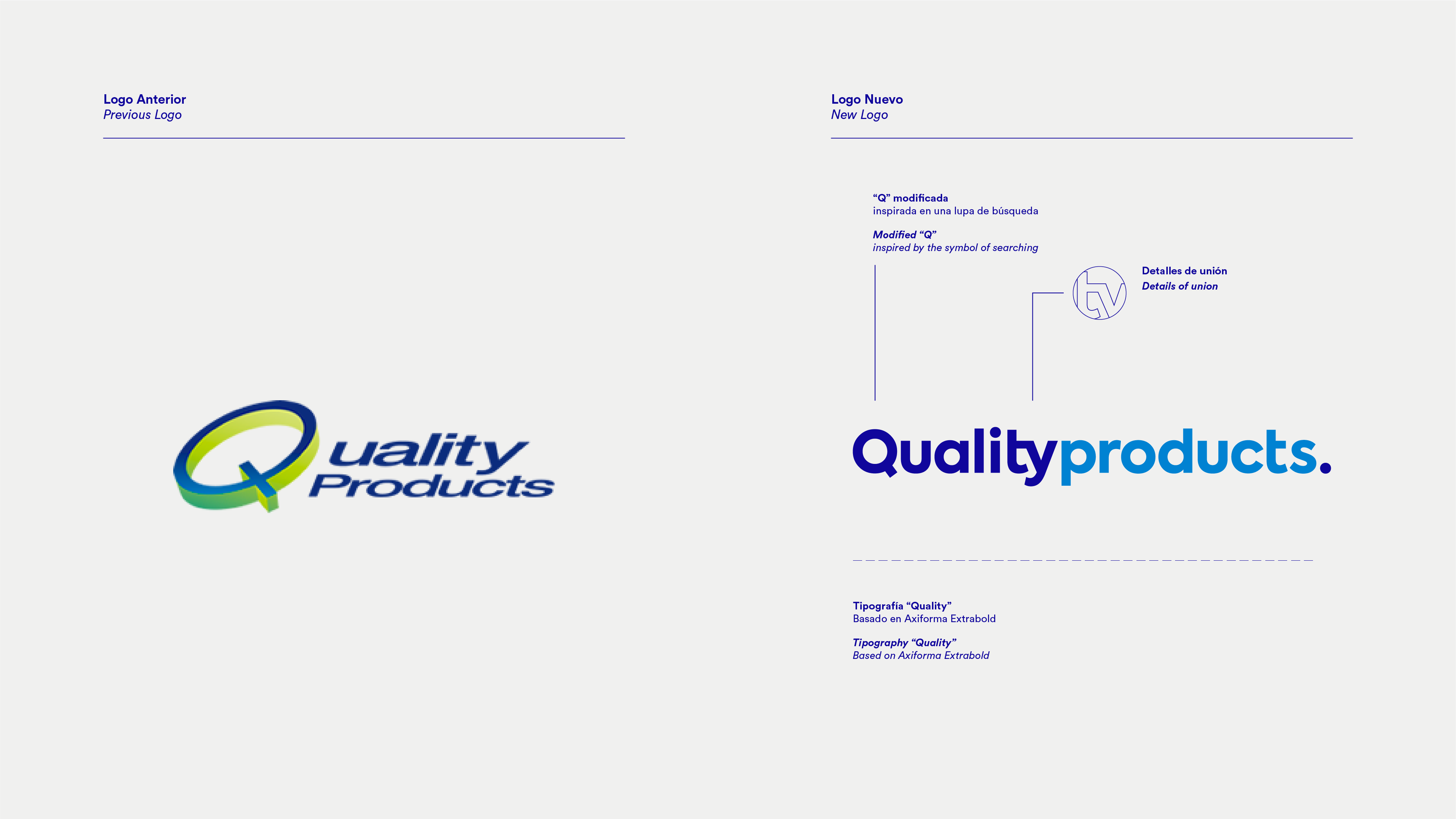

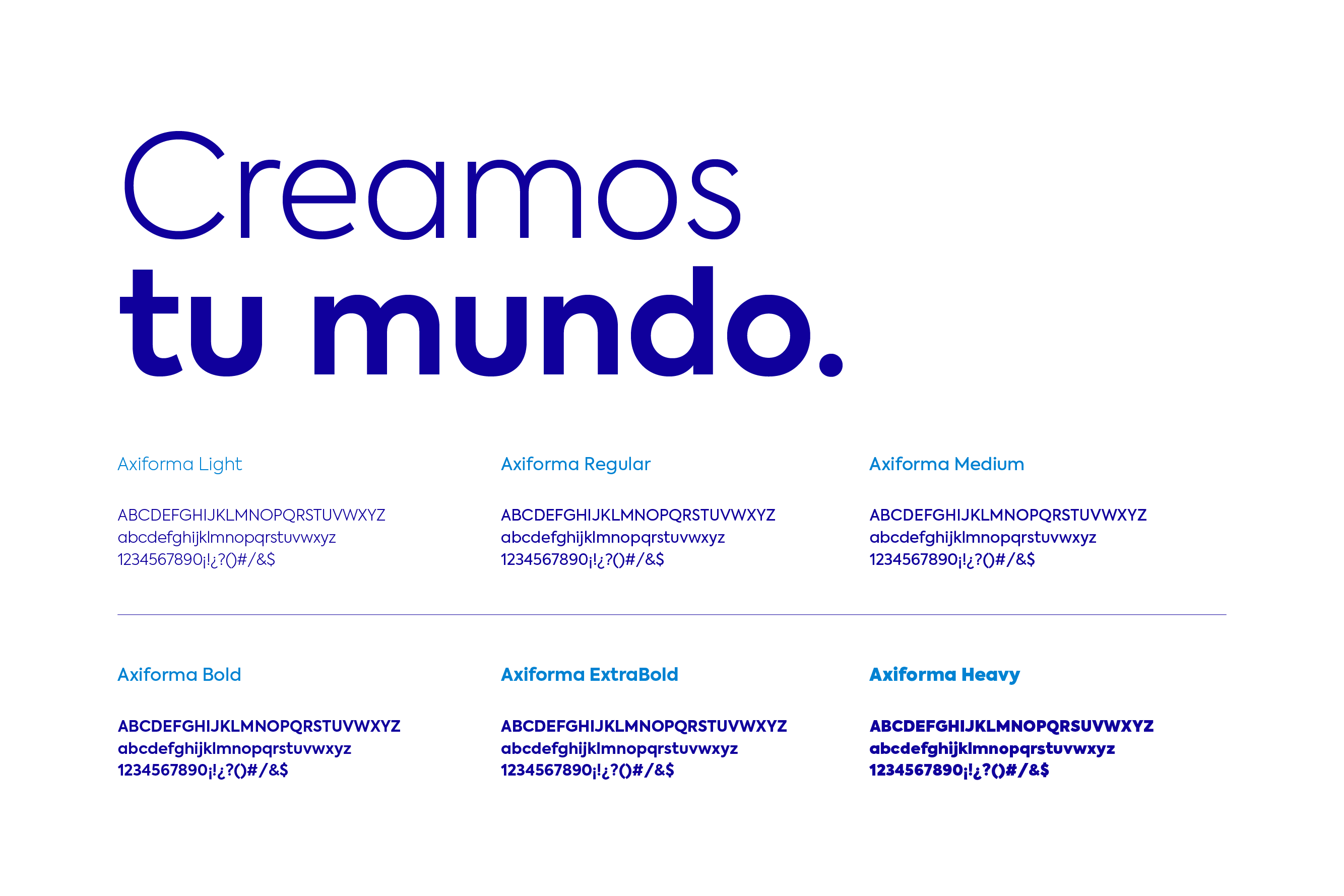
The name Quality Products is extensive, so we selected a modern and simple typography that is easy to read, also the difference in color between the two words helps to distinguish them, while giving greater strength to the name Quality. We created the new brand icon centered on the “Q” that simulates a magnifying glass, a very modern element that tells us that in Quality Products you can find what you need, and we finish with a dot that makes the search easier for you.



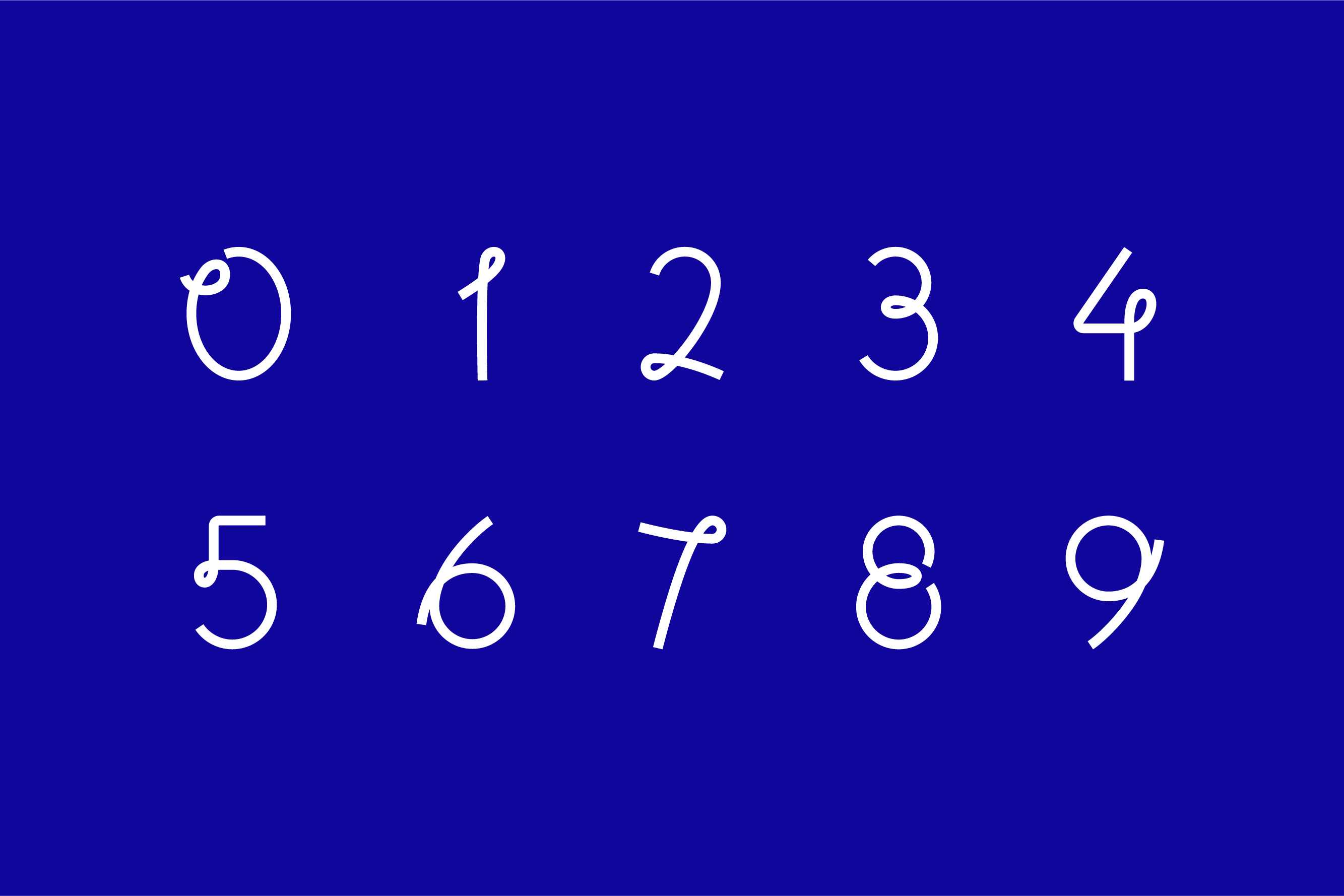
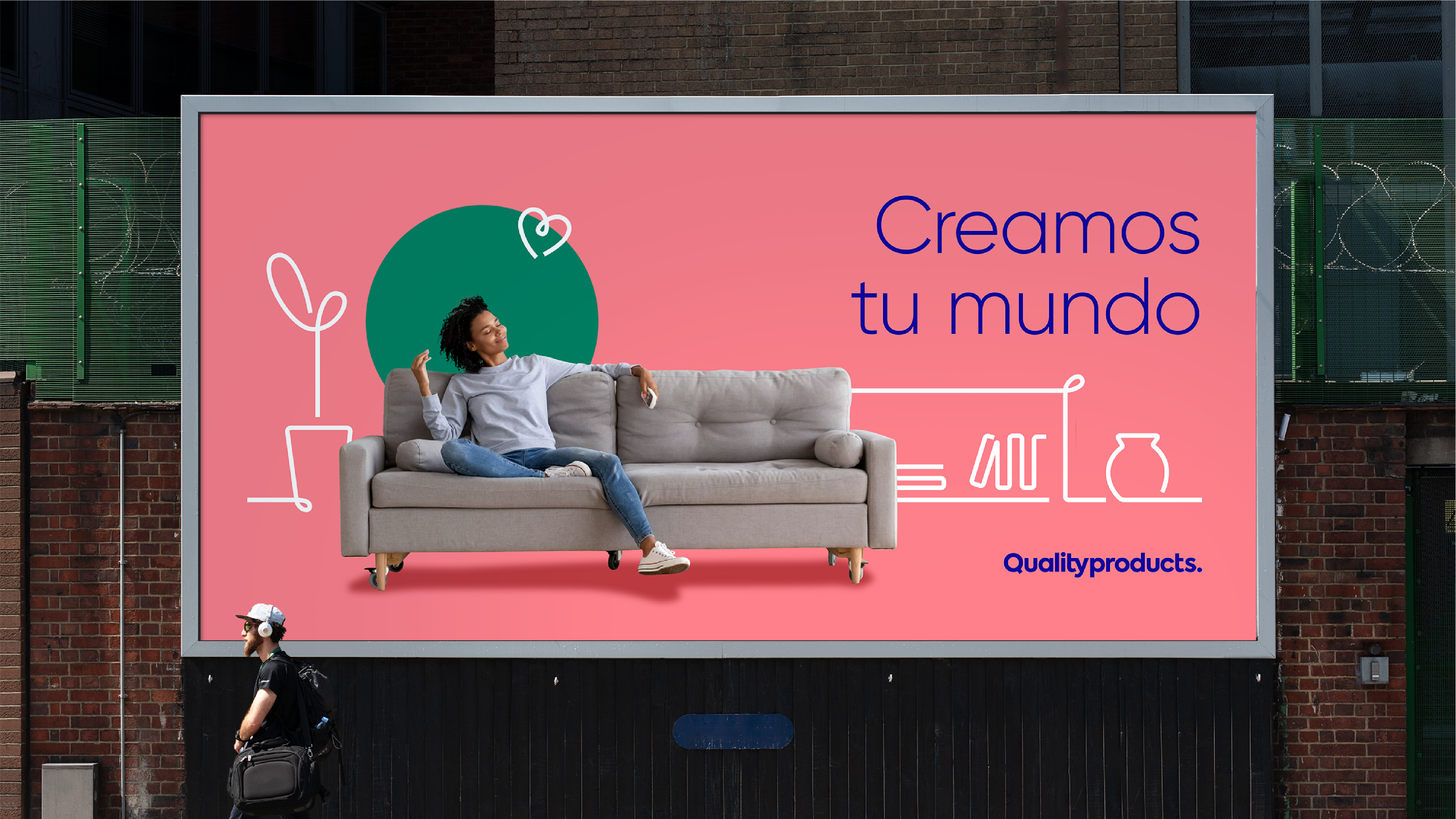
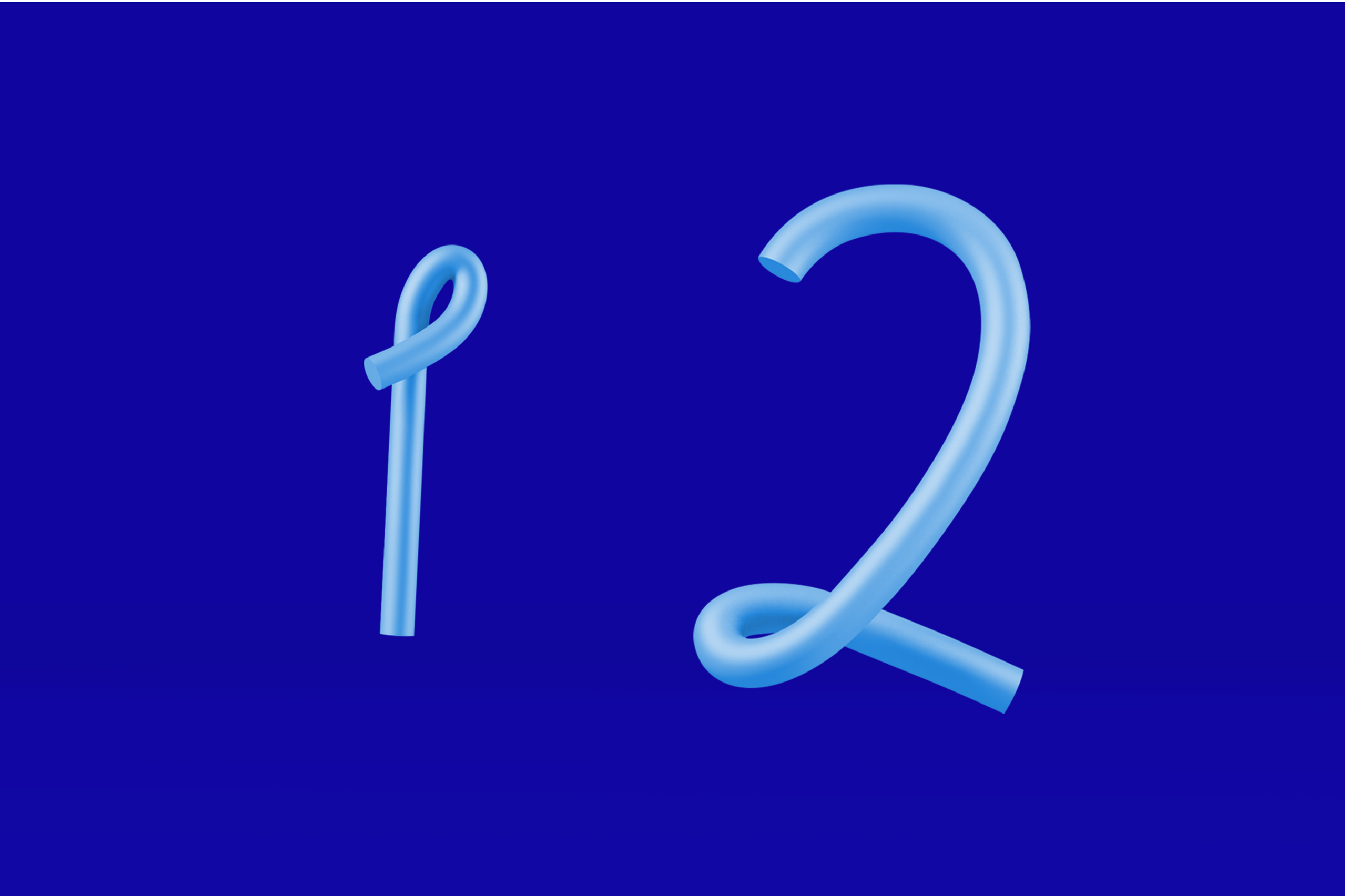
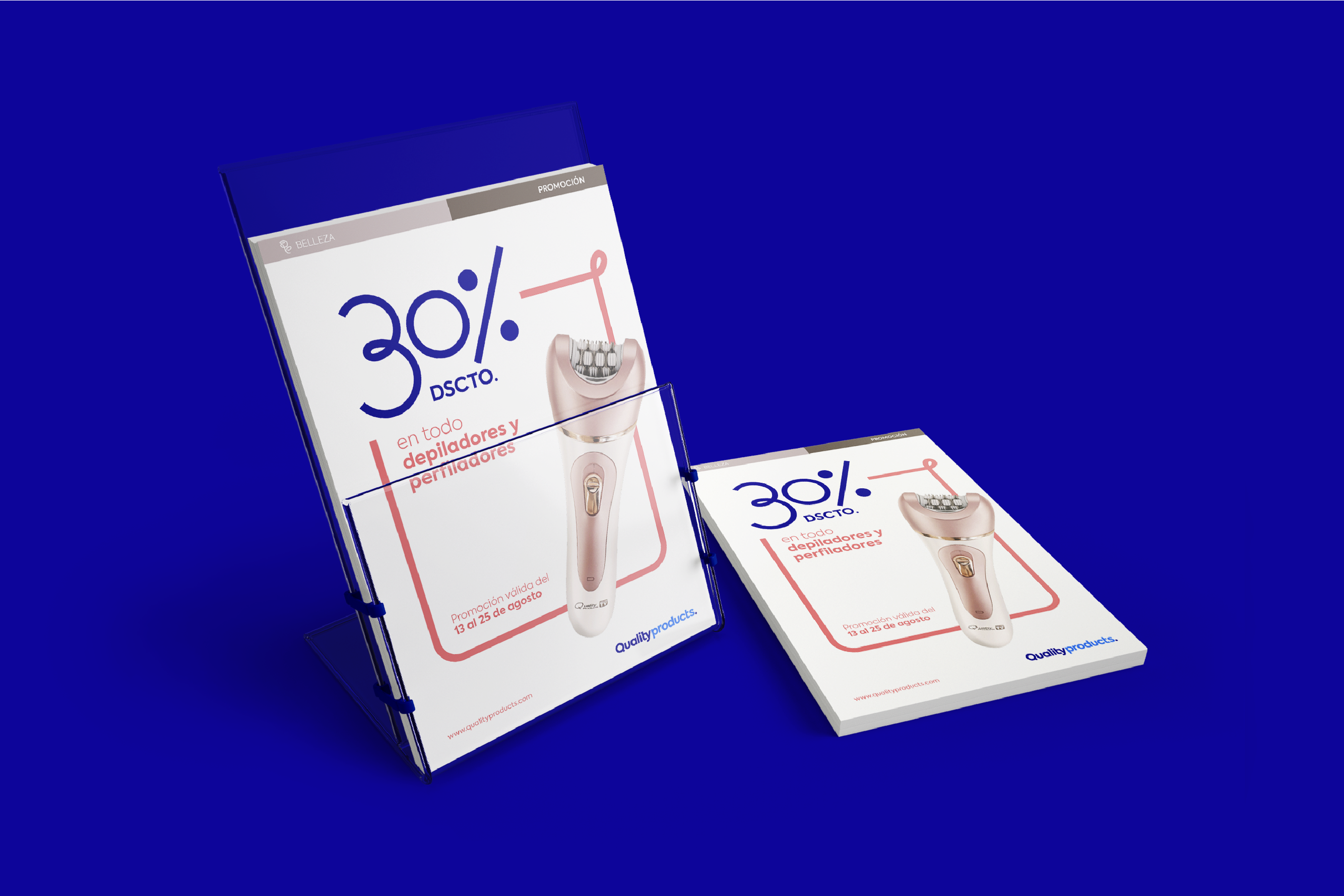
The concept “We understand your world” inspired us to create new graphic tools for Quality Products. We created lines that draw the imaginary that we dream for ourselves, for our home, for our lives. Expressing freedom, flexibility and dynamism, we get involved and participate in our clients’ lives, helping them to complement their world. These lines always end with a dot, just like our logo.
The new Quality products identity continues to connect with long-time customers, but at the same time, with the new generations. It is a modern but close identity, which is revitalized to continue accompanying us in our homes.
